The Making Of An Iconic Football Kit – Inside The Game
A club’s football kit is often the most prized possession of a football fan who can wear the same outfit of their beloved team and their favourite player while willing their charges on from inside the ground or from afar. Wearing your team’s shirt is a conversation starter on the train, a reason for curious looks from strangers when you’re out on the road, but more than anything it’s a badge of honour, a matter of pride to every supporter like vip online casino for arab players.
Football culture is so rich, and nowhere more so than in the Italian game, that older kits now are cooler than ever and every ardent Serie A follower will know someone who owns at least a ‘Totti 10’ shirt. But how does a football kit go from an idea to reality? What is the process? I tracked down David Hicks, a noted graphic designer from England, who designed the highly admired AS Roma kits during the 1998-1999 and 1999-2000 seasons, to share his unique insight into the enchanting process.
Can you tell us a bit about your background in design and how you got started?
I’ve been working as a graphic designer in London since August 1993, for various agencies and publishing companies, working on projects including branding and logos, merchandise, and design for a variety of magazines like GQ, T3, Manchester United, AS Roma, Total Film, Top Gear, Men’s Health and more.
Photo: David Hicks / @David_Hicks
My work is mostly art direction for magazines and books, but from around 2014 I’ve been focussing on designing branding, websites and online experiences for my own clients. Before that, I studied for a graphic design degree at Kingston just outside of London.
What was your first design work in football?
Well I was working for a creative agency in London, called Zone – such a great place to work and be creative, and a great team. Their main work was for Manchester United FC, designing all their books and magazines – as well as official merchandise products for The Spice Girls and more. It was just a great opportunity for me, as I am a supporter of United, so a dream job for me.
I was so fortunate to work on photoshoots with the players, the manager, and all the products based around the club – the history, the latest news, and also the ‘collectibles’ like the Treble DVD cover and Special Edition book designs. And yes, I got to see many of the games at Old Trafford and on away trips.
How did you first get in contact with AS Roma?
Back in September 1997, I was asked by Edward Freeman (the father of James Freedman, the managing director at Zone) if I could help him with some project work for Roma, in addition to my work with United. And of course I was delighted to accept. I remember him popping over to my desk and asking me, “Have you ever designed any merchandise?”
I couldn’t quite believe it when he asked me to think about a design for Roma’s kits, home and away versions, to send to Diadora and work with the club sponsor to make sure everything was right! To Edward, this was no new thing – he had previously been the Commercial Director for Manchester United, who were so successful with merchandise and their Official Megastores. We also worked on merchandise designs for Athletic Bilbao, and Sparta Prague, amongst others.
How does the process of designing a kit for a club work? Do they give you a brief, you make some concepts and then go back and for and tweak it?
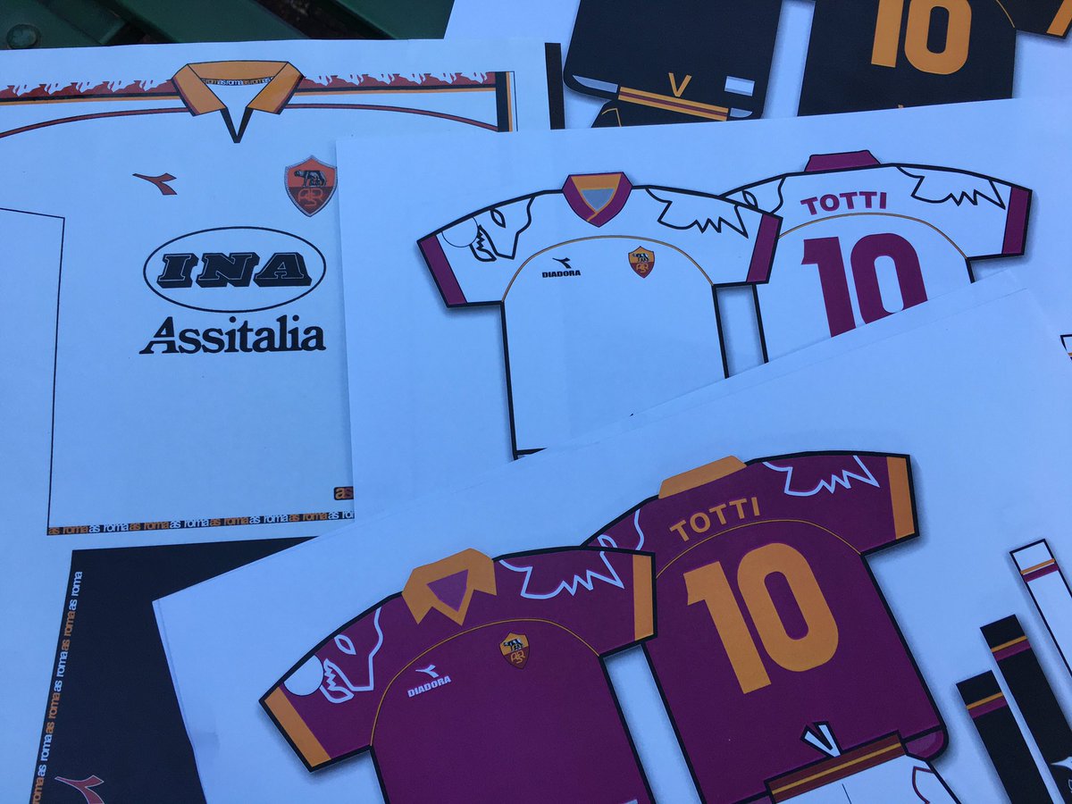
I had a brief conversation with Edward about it – and then went away and kept myself to myself, so to speak – to avoid any distractions! I started with a quick sketch, and we used some existing kits as our inspiration – mainly the Umbro kits from 1996/97 – in particular United, with the repeat pattern down the side of the sleeve. I sketched out the ideas, showed them to Edward – and then worked up a more detailed design on my computer using Illustrator and InDesign.
1999: I designed this kit for @ASRomaEN so proud… 👇🏼 pic.twitter.com/whmQFfqOxq
— David Hicks (@David_Hicks) July 13, 2020
What ideas did you have early on? Anything risky or drastic for the design?
I researched the club’s existing products, which to be honest, weren’t all that great at the time – we looked at what the ultras were doing with some of their flags and scarves, and also looked at other sports’ merchandise styling and design.
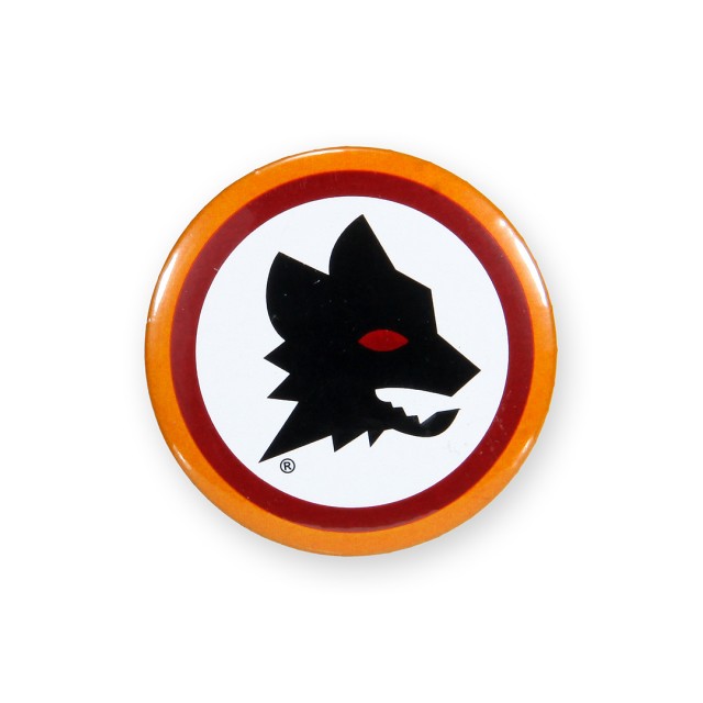
To be completely honest, my first design went to Roma and Diadora, who approved it straight away, and we then worked on the details and with Diadora on artworking it all. So the shirt you see now, from 1998 is the first design I created… with the collars for the players to turn up, and the wolf graphic – the Lupetto – repeated down the side.
I remember re-drawing the artwork for Lupetto, as the lines were pretty rough on the version we had – so I redrew it for Diadora. We added the repeat ‘asroma’ logotype to the piping, and also the inner hem detail. I also wanted to ‘reverse’ out the design for the away kit and this worked so well, white shirt with the white Lupetto. The third kit in grey, is so hard to find nowadays, I’d love one to complete my set!
Quite incredible now to think that I had an influence on something so cherished by so many fans. I also had to create finished artwork for the club crest, for all the different processes. Can’t actually remember how many times I had to fix up some artwork but we were redesigning everything for the club – kits, scarves, flags, key rings, rugs, and even kids’ lunch boxes!!
What do you think makes a successful football kit?
Good question. No.1 is colour. The use of colour is so vital – the right colour, and the right tone of colour. I also think style is important, as players want to look cool, and fans as well – they wear the shirt as a badge of honour at games, but also to go shopping in, wash the car, even sleep in!
So there has to be an element of style – whether a small detail like buttons/zips/cuffs, or even something subtle like a pattern within the textile. I also think the away shirt is SO important to get right. When some teams go with colours that mean nothing to the branding and history of the club, I think that’s when it goes wrong.
Fit is also important, and making use of new technology as well – for eample, dry-fit – and so on. I always like to see a new idea, a concept, something historically associated with the club perhaps, or something else – perhaps a local school has an idea, or a competition with the winner chosen by the fans?
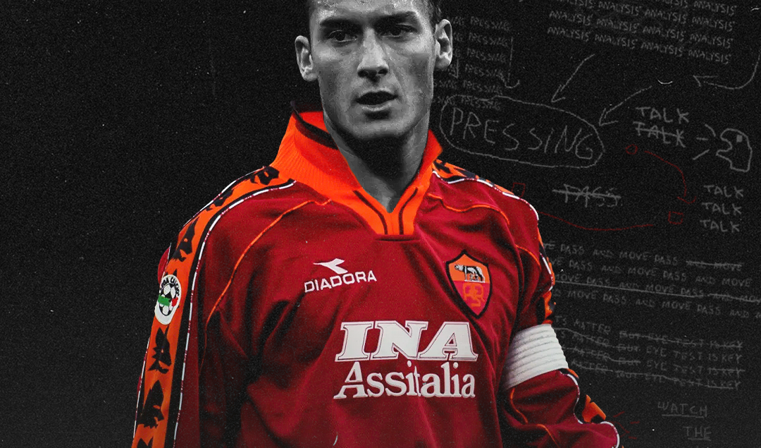
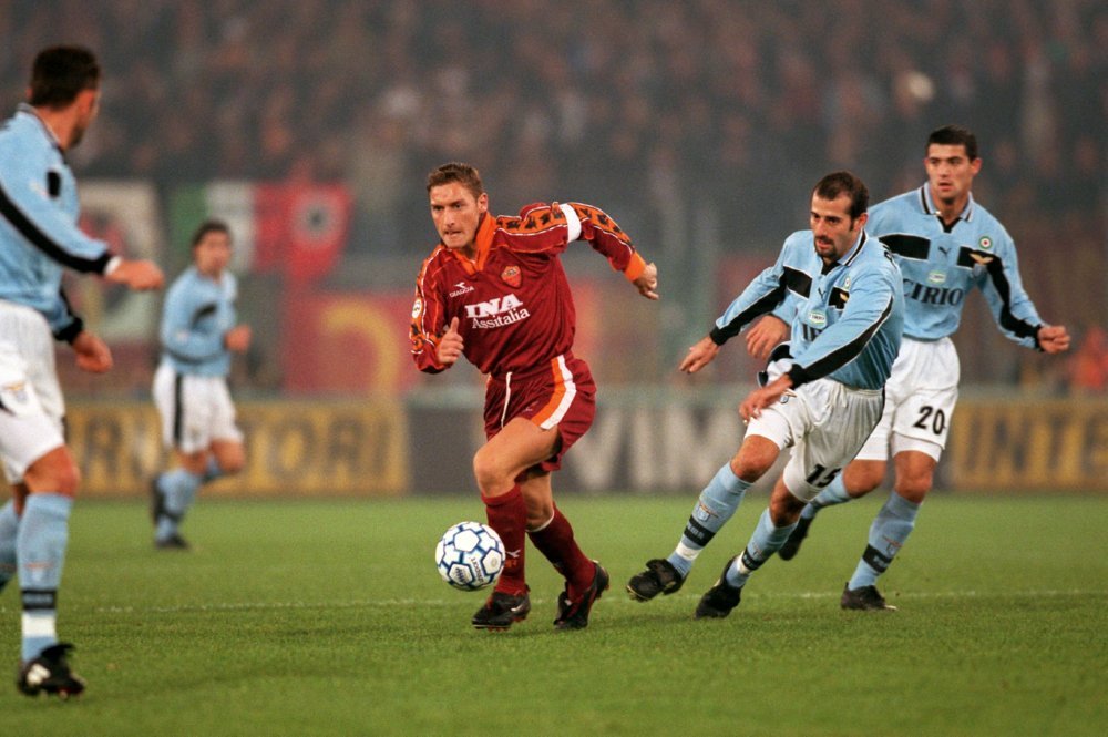
I think the 1998 kit is popular because of the sleeves, and the Lupetto, and also the structural elements like the piping, and the design of the collar. It’s a great combination, and could easily work again in 2021… but perhaps a little better fitted, and not so loose.
What was your reaction when you finally received approval from the club for your design?
It was 1998, and I couldn’t quite believe it could all happen so fast. The first time I saw the team in the kit was in the magazine – goosebumps. I also designed the kit the following year – with a much larger Lupetto on the arms. It was a more simplified kit and I think was more successful.
Photo: Michael Steele / EMPICS Sport
Did you hear any feedback from the players and fans?
Funnily enough, not at the time. The only people I had spoken with were a few of the management team at the club who were all so nice, and my colleagues at Zone of course. But lately I’ve been getting so many kind messages from fans on social media saying how much they loved those two kits and asking if I could design the next one!
Could you believe what you were seeing when players such as Totti and Cafu were wearing a kit that you designed in the world’s best league?
Again, incredible. These guys were so nice when I met them at the magazine launch. I don’t really speak much Italian (or Portuguese!), so it was just handshakes, nods and winks. Totti is an absolute legend – and I’ll forever be grateful for the opportunity to design a kit for Francesco! I think he was only around 20 at the time, but it was still cool to meet him.
The squad was packed with such talent at the time, Aldair, Cafu, Delvecchio, Paolo Sergio, Alenichev, Candela, Conti, Di Francesco. What a team!
Can you tell us about the kit launch and when you first got your hands on an official shirt?
I was working on a project for United, and Edward came in to the office, which was open plan – and said “David, David – I’ve got your kits!” It was amazing to see the shirts without any sponsorship on – he gave me the home and away kits (and I still have them!).
I used to wear the home kit for our friendly Sunday football practice matches – and people used to call me ‘Roma’! I haven’t worn the kit for some time though as they are quite precious. Perhaps if I visit the club for a game one day, I’ll stick it on and see if anyone notices that there is no sponsor on it!
You must have a few stories from the red carpet launch event that you can share?
What a night! The club were launching a new magazine, a new store, the new kits and more so it was a big celebration really. I met most of the players – they were in season training still so they all sat on the same long table in their grey suits, actually looking like this was the last place they wanted to be, understandably.
No drink, no partying, just turn up and ‘pretend’ to enjoy yourself! We had a great time though and I remember well, describing how I designed the kits, to a group of people including Rosella Sensi, Frederico Colonna, and James Richardson of the weekly Serie A TV show Gazzetta Italia!
Those kits from that time are still iconic and widely worn today. What were your highlights from the project and what was it like dealing with AS Roma?
That’s very kind of you to say – it was just a brilliant project to work on, and Roma were just so nice. The team from the club’s shirt sponsor, INA Assitalia, were great to work with as well. I also remember asking an illustrator friend of mine to design a kids version of Lupetto, so we could use that for lunchboxes and posters and t-shirts, and bizarrely this drawing ended up being the club mascot design too!
Photo: AS Roma Store
Would you like to revisit this and one day do it all over again for Roma?
100%. Assolutamente! I would have loved to have done more, but I moved jobs to another company and worked in a different area of design after that. One day maybe…
Have you seen this season’s AS Roma home and away kit? What do you think?
I think they look great – as if designed with the supporters in mind – something they can wear casually as well as a badge of their passion for the club. The colours really pop and the design is quite simple. Very 2020!
Finally, do you have any advice for an aspiring graphic designer looking to follow their passion and work in football?
Research your club, find out names, send ideas to the commercial department, find out who does the agency work for the club – and study the latest techniques in design for sportswear, and most importantly love what you do because ultimately that’s what will show in your ideas and passion for design.
By: Mark Pickering
Featured Image: @GabFoligno / Stu Forster / Getty Images Sport Classic
Find out more on David Hicks at davidhicksdesign.co.uk


