A New Dawn in Milan
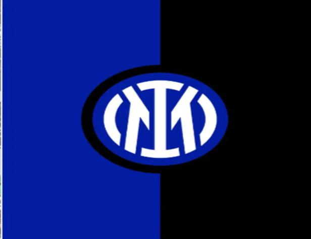
Following months of speculation and ambivalence, the new ‘I’ and ‘M’ graced the Inter Milan crest in what can be seen as a radical logo rebrand. There was speculation this change won’t happen until the club was about to mark its 113th…
Illustrator Gabriel Foligno Photographer Emilio Andreoli - Inter
Following months of speculation and ambivalence, the new ‘I’ and ‘M’ graced the Inter Milan crest in what can be seen as a radical logo rebrand. There was speculation this change won’t happen until the club was about to mark its 113th anniversary in March and Nerazzurri hierarchy duly delivered with this new revamp being presented on the last the 30th of March.
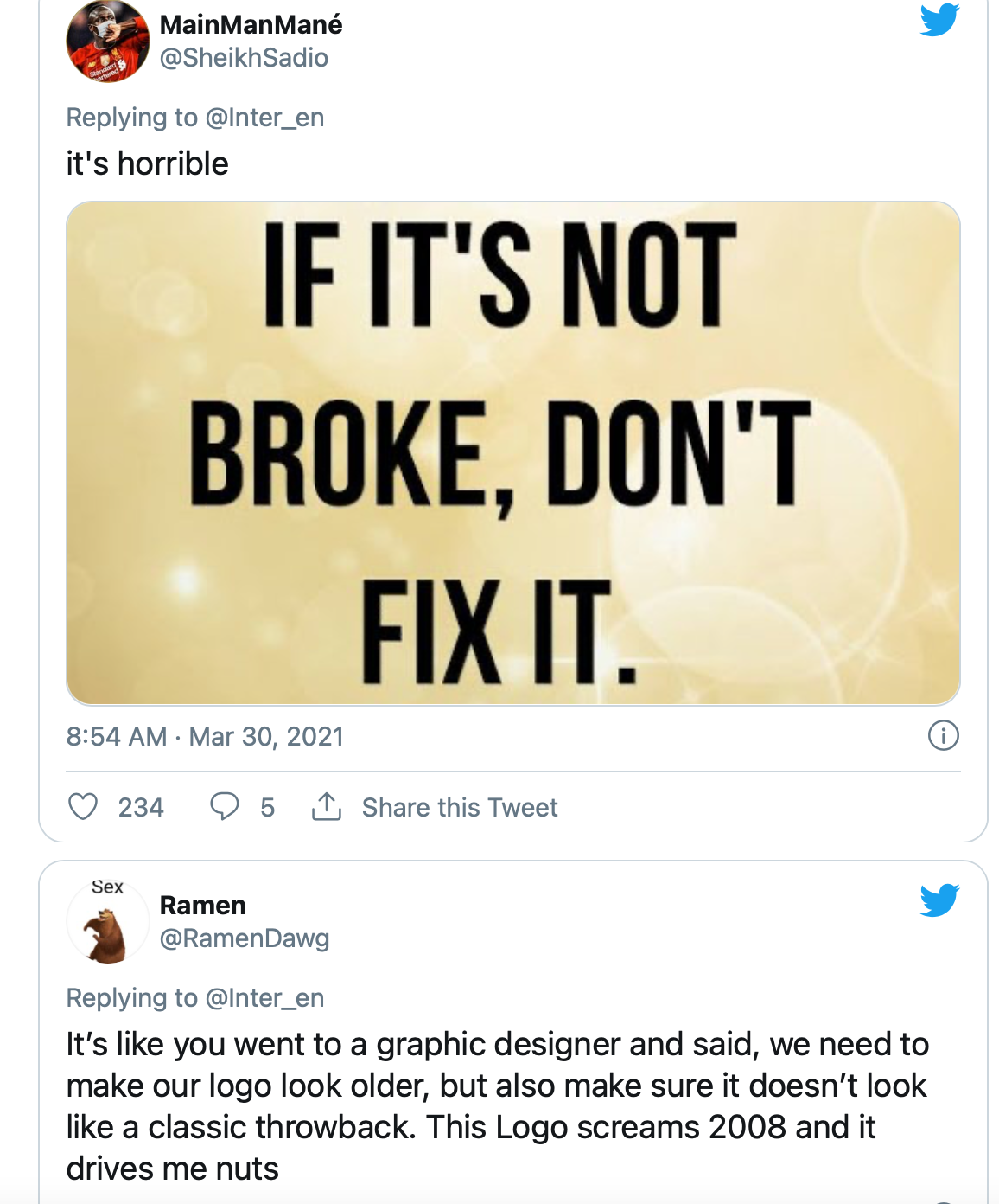
Nonetheless, this hasn’t been well received by the “Fossa dei Leoni”— Inter Milan Ultras or even Inter Milan aficionado’s alike. Their dissatisfaction hasn’t gone unnoticed especially with them venting their frustration in the same manner as the Juventus fans back in July 2017 when their famous logo was diminished to just a ‘J’.
A Logo Change Too Soon?
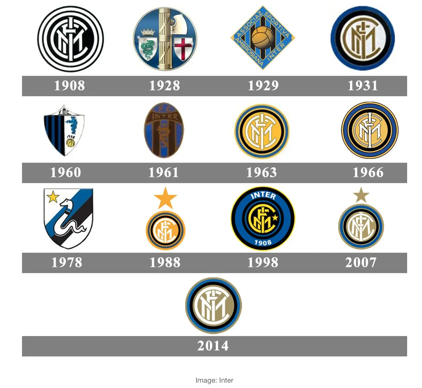
Prior to this change, the most recent logo change was done back in 2014. The Inter media team at the time described that change as modernized, explaining how the lines have been simplified with few circles surrounding them unlike the logo of 2010 with the star on top. They go on to say the dimensions have also been balanced for enhanced recognition.
So why this recent change? Why does this new change look like a copy of Juventus? It feels like all of the club's history has been wiped away in one go and their fans are not happy about it. How many times have the Italian outfit changed their logo? Let's take a trip down memory lane and scroll through the history of Inter Milan's logos.
Since being founded in 1908, the legendary San Siro tenant has undergone massive crest rebrands on a number of occasions. For certain, they have had 15 logo changes in their 113-year reign. However, two things remained constant in their logos for a major part of the club’s long history— the circular monogram and the snake.
Additionally, their first-ever logo was designed by one of their founders, Giorgio Muggiani and this continued for the next two decades. As shown below, their first decades at the club had the initials of ‘FCIM’ which crossed each other in a circular shape. This was embedded in a golden background that gave away its personal distinction and finally finished with the crest that enclosed in two black and two blue circles.
Inspired by Juventus?
The Old Lady made their own radical change back in July 2017 and got its own fair share of uproar but 4 years down the line, it seems their Milano rivals are now following suit. The recently launched club logo pulsates the team's current jersey color. This new crest according to the Italian media was inspired by the Juventus Logo change that made waves when introduced to the public, although, their fans were not happy in the first instance.
Evolve or Die?
If anything, the Nerazzurri faithful should learn from their Turin counterparts that changes like these can yield results in the long term. Who would have thought Juventus will sign a deal with Pharrell Williams for the Human Race x Juventus Jerseys? Or that they will get signed by Netflix to do a documentary or Lastly, collaborate with London-based skate brand “Palace” which was even supported at an exhibition of innovative pipe joints at Milan Design Week.
This radical change is rather necessary in light of the COVID-19 pandemic as clubs look to be more of a global brand and presence because of the vast doors and opportunities it opens. Having seen Juventus’ successes off the pitch, this was what the official statement from the club had to say:
“Inter has moved to revamp its visual identity to open up to an audience that is increasingly digital and sensitive to aesthetics, to reach global targets and different age groups, and to establish itself as an icon of culture as well as sport. The aim is to make the Inter brand relevant and recognizable beyond its fanbase and to allow a younger and international audience to identify with the values of inclusion, style and innovation that have characterized Inter since its inception.”
To establish themselves they did as in less than 24 hours since the release of the new logo, they launched their first lifestyle collection that revealed the new logo and visual identity in a campaign they describe as the “I M COLLECTION,” as seen below.

A comment from the picture further supports the need for this change – “evolve or risk getting left behind”. A message many football fans around the globe should pay attention too as other clubs will follow suite in years to come.
Fan Reaction
The themes of fan reaction below in this analysis draw a conclusion to fans feeling betrayal, rejection and selling out with very few of them seeing this change as an entrepreneurship move by the club. A move that can be described as a ‘game changer’ by introducing football into the future. A move that can be described as disruptive; it takes soccer into new domains and makes the club known in new countries and also people that do not know them and what they stand for. Consequently, this new logo opens doors for the future of football and Inter Milano.
Conclusion
From the analysis, one can say for future clubs interested in such or even for Inter to make peace with their fans; they should make an attempt in explaining how the club have adopted this new visual identity and taken on a style with a more profound meaning to offer a range of unique experiences aimed at the fans and also a broader audience, as this is one of the major concerns with the change.
Additionally, in an attempt to make more of these changes, surveys, as well as consultations with supporters, should be done before a decision is made. Also, in the event any changes made, whether to the logo or anything affiliated with the club, they should be able to explain to their consumers.
By: Louis Thompson
Credits
Words
Louis Thompson
More from Breaking The Lines coming soon.
Visit the profile to follow and get notified when the next piece lands.