Creating A Facebook Bio: Hidden Text And Structure
Facebook doesn’t shout like it used to, but it still reveals a lot.
Someone sees a Reel you posted. They notice a sharp comment you left in a group. Maybe your name comes up in a discussion. Curiosity kicks in, they click your profile, and within a few seconds they’ve made a decision.
Stay or bounce.
That moment is why creating a stylish Facebook bio in 2026 matters more than people think. Not because it looks nice, but because it gives shape to that first impression. A good bio doesn’t perform. It organizes.
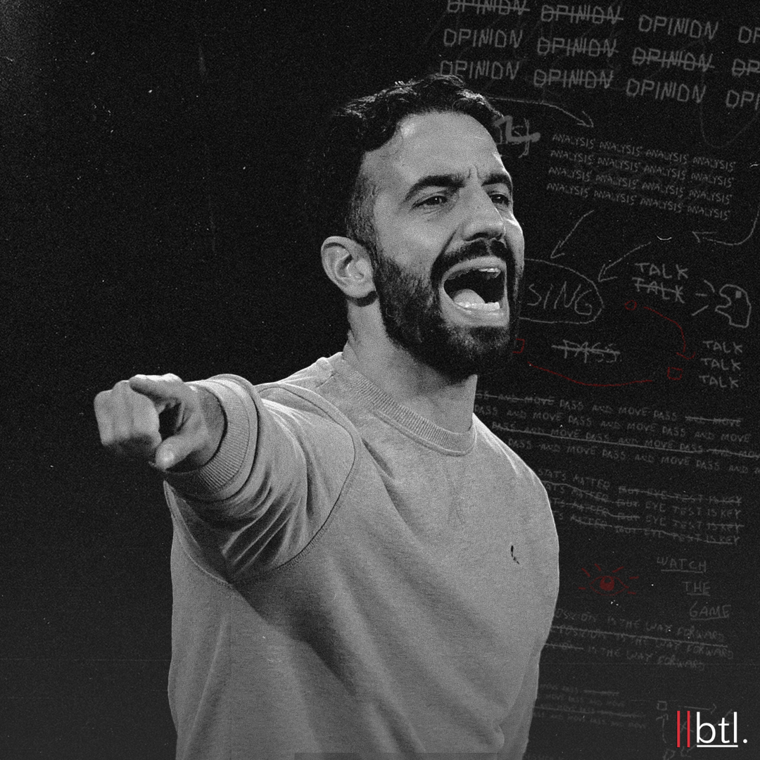
As Facebook Reels continue to act as the primary discovery layer, many creators rely on tools like fvdownloader to study, archive, and repurpose short-form video without disrupting the platform’s native flow.
Why The Facebook Bio Still Functions Like A Scouting Report
Facebook is no longer the main stage of the internet, but it remains one of its most reliable reference points. It’s where people go to verify. To sense-check. To see whether what they just encountered lines up with a real, coherent profile.
Your bio sits at the top of that experience. It’s not there to explain everything. It’s there to establish structure quickly.
In practice, visitors are subconsciously asking:
- Who is this person?
- What are they focused on right now?
- Is this profile worth my attention?
- What’s the obvious next move, if there is one?
If your bio answers those questions cleanly, the rest of the profile gets time to breathe.
The Two Technical Elements Behind Most Modern Bios
Most bios that look “designed” are actually using very basic tools.
The first is Unicode text. Facebook doesn’t allow font selection, but Unicode includes alternate versions of letters that resemble bold, serif, monospaced, or small-cap styles. When people talk about stylish fonts on Facebook, they’re usually just pasting Unicode characters.
Used lightly, Unicode helps establish an anchor line. Used everywhere, it hurts readability and breaks scanning rhythm.
The second element is invisible spacing. Facebook collapses normal spaces aggressively. Certain Unicode whitespace characters don’t collapse the same way, which allows you to create separation between lines without adding visible symbols.
This is often what people mean by hidden text. It’s not about hiding information. It’s about forcing the interface to respect layout.
Utilities like InvisibleText exist because this behavior is consistent enough to be useful. The key is intent. Invisible characters are for structure, not manipulation.
Why Structure Beats Aesthetics Every Time
You can make a bio look interesting and still fail if the structure is wrong.
That’s why creating a good Facebook bio always starts without styling. If the message doesn’t make sense in plain text, styling only makes the problem more visible.
A strong bio prioritizes layout over flair. It gives the eye a path to follow instead of multiple options fighting for attention.
This is the same principle that applies in tactical systems. Shape comes before expression.
The Four-Part Structure That Consistently Works
Most high-performing bios, regardless of niche, follow a similar rhythm.
- The anchor: A clear identity line written in human language. This is usually the only line that receives subtle Unicode styling.
- The current focus: What matters now. Not your entire background. Not old roles. Just the present phase.
- The validation: One small detail that adds credibility or texture. Frequency, format, scope, or intent.
- The release: A soft next step. Follow, DM, link, or nothing at all if engagement isn’t the goal.
Not every bio needs all four, but when they’re present, the profile usually feels complete rather than cluttered.
Not every bio needs all of these elements, but when they’re present, the profile usually feels complete.
Common Mistakes That Quietly Undermine A Bio
Over-styling every line so nothing stands out is the most common error. When everything is emphasized, nothing carries weight. This often happens when people lean too heavily on fancy fonts, swapping readability for novelty. Decorative Unicode styles can look interesting at first glance, but they slow scanning and create friction, especially on mobile.
Outdated bios are just as damaging. When your content shifts but your bio stays frozen in a previous phase, the disconnect is immediate. The profile feels unmaintained, even if the posts themselves are sharp and current.
There’s also a line that shouldn’t be crossed with invisible characters. Using them to improve spacing is one thing. Using them to hide text, mask keyword stuffing, or manipulate layout in deceptive ways backfires quickly. It harms accessibility, weakens trust, and signals the wrong kind of intent.
Simple, current, and readable almost always wins.
Examples Of Stylish Facebook Bios That Still Feel Human
A creator-focused bio might open with a simple identity, mention the kind of content being shared, and end with a calm invitation to follow.
A local business bio might lead with the business name, clarify the service area, and gently direct people toward messages or bookings.
A minimalist personal profile might simply state what the person is building or learning, without any call to action at all.
In each case, the structure stays the same. One idea leads. Everything else supports it.
Final Thought
At its core, creating a good Facebook bio isn’t about aesthetics or tricks. It’s about respect for attention.
A well-structured bio feels calm. It gives orientation instead of noise. It allows the viewer to understand who you are without friction.
When the shape is right, you don’t need to chase engagement. The profile does the work for you.