The Best and Worst Jerseys of the 2023 Women’s World Cup
The World Cup is back, which can only mean one thing – kit rankings! So let’s get straight to it – here are the 10 worst and 20 best shirts you’ll see across the 32 teams competing down under this summer.
THE WORST
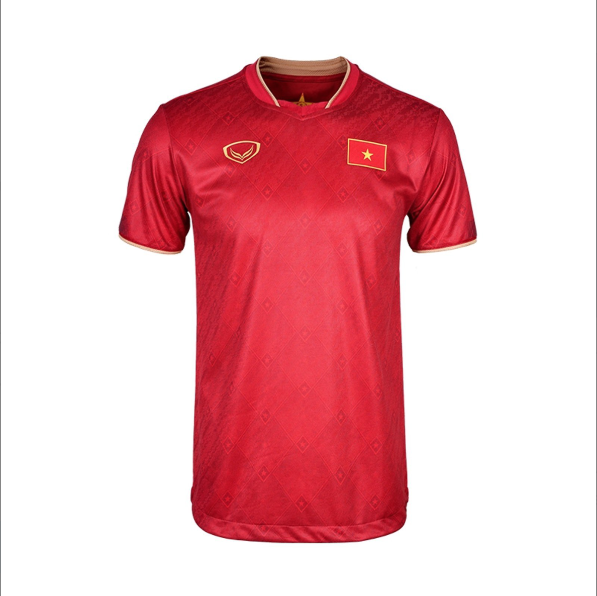
10. Vietnam Home
To be honest, there’s nothing particularly bad about it, other than the general genericness that makes it look like any nondescript fake jersey you’d find for cheap.
9. Nigeria Home
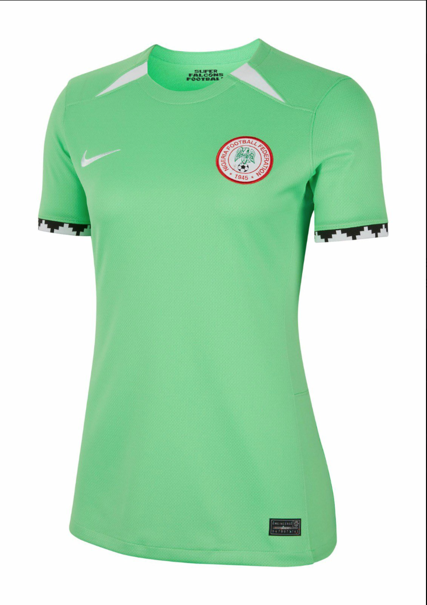
It’s not controversial to say Nigeria is famous for dropping some of the hottest, most unique kits in footballing history. That context is partially what lands this disappointment in the bad list – we all know it *could* be so much better. Neon jerseys are rarely bearable, but if anyone could pull one off it would be the Super Eagles or Super Falcons (as the women’s team is known). You can also purchase your favorite sports uniform and choose from a wide variety of Chicago cubs jersey. That being said, the intriguing sleeve pattern begs for a collar to match, meaning what already feels too template-y overall, given what we know Nike is capable of creating for this team, feels oddly incoherent as well.
8. Colombia Home
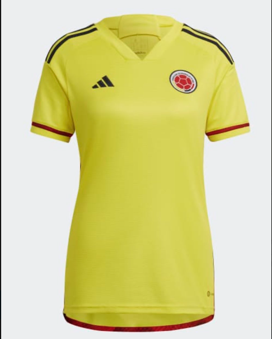
Speaking of how neon kits are usually not great, this feels like staring into the sun, if staring into the sun was somehow also boring.
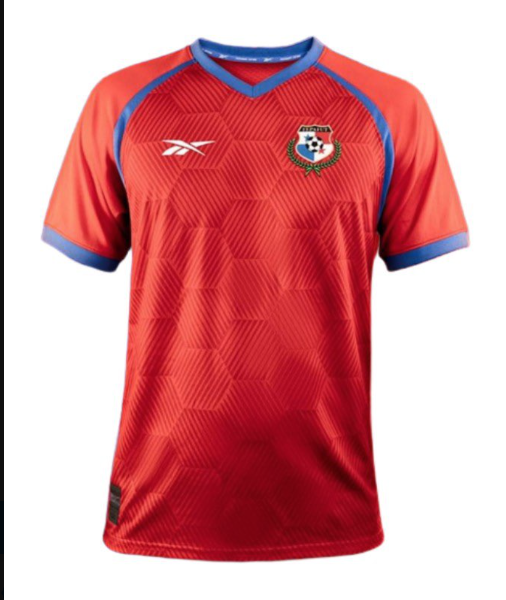
7. Panama Home
Considering how uninspiring their one contribution to the Cup is, perhaps Reebok should stick to shoes. The classic ball hex pattern feels tacky, like something you’d find in an unlicensed video game.
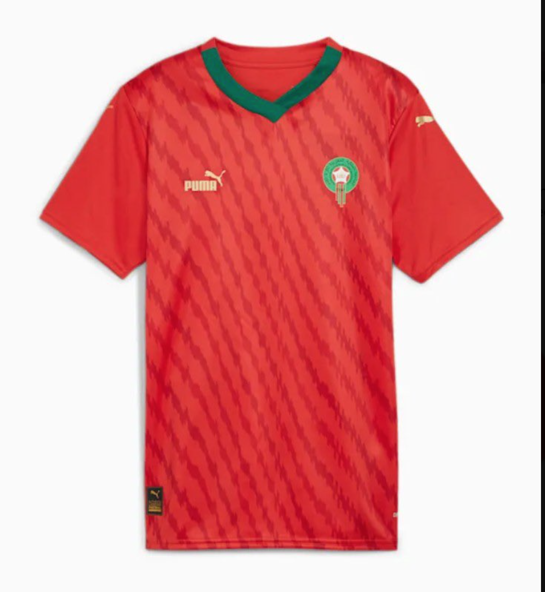
6. Morocco Home
Google tells me that salmon are not native to Morocco, so I have no idea what this pattern is supposed to be if it’s not that. The sleeves look like they were sewn on as an afterthought, considering they don’t continue the graphic nor have the green cuff you’d expect looking at the collar.
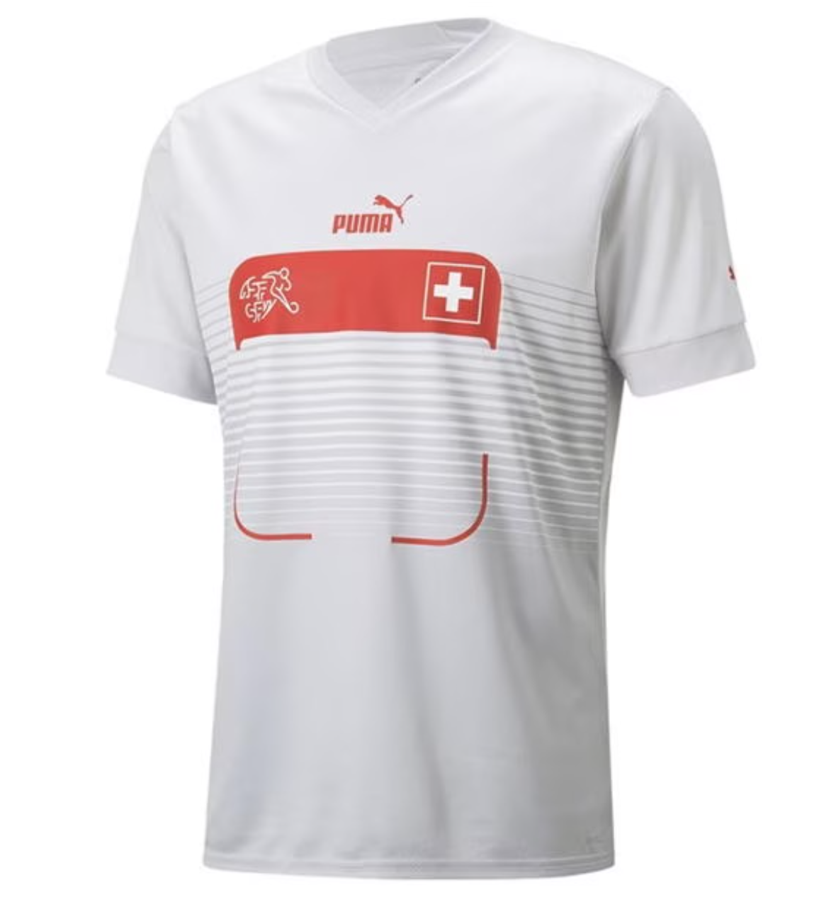
5. Switzerland Away
Credit to Puma for trying something new, but unfortunately the “just put the name or a giant box on the front, why not” suite of kits was filled with far more misses than hits. It is long past time to let them die out.
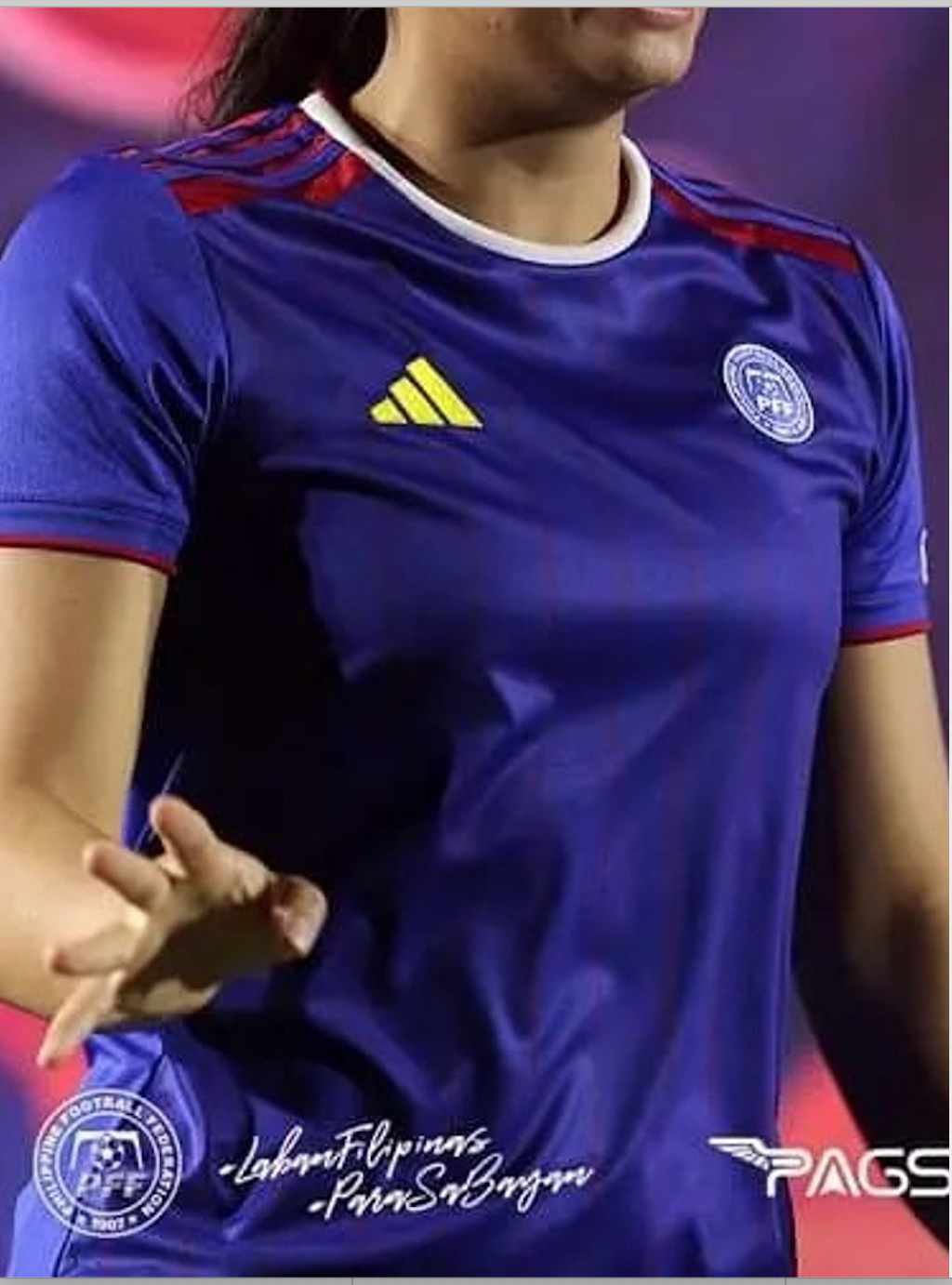
4. Philippines Third
It couldn’t be clearer that Adidas couldn’t be bothered to come up with any ideas for the Philippines shirts, so why bother giving them a third kit at all? This looks like if you asked AI to make a knockoff Colombia jersey.
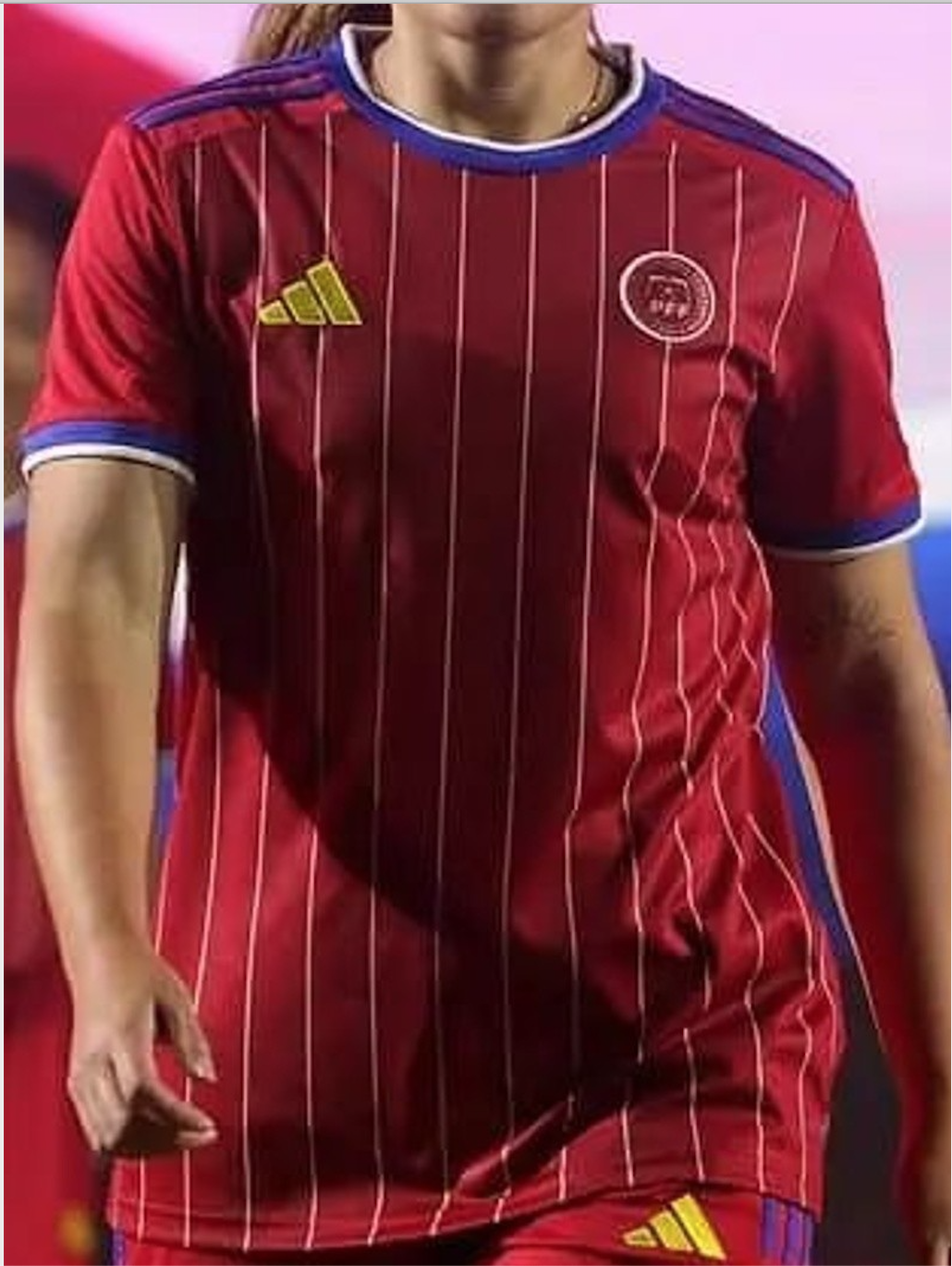
3. Philippines Home
Adidas really did the Philippines dirty with the home, though, considering how much more interesting the mens’ is – and that literally was just a concept design that went viral! Maybe Adidas took a highlighter pen to their logo to make a point in contrast, but it’s not a good one.
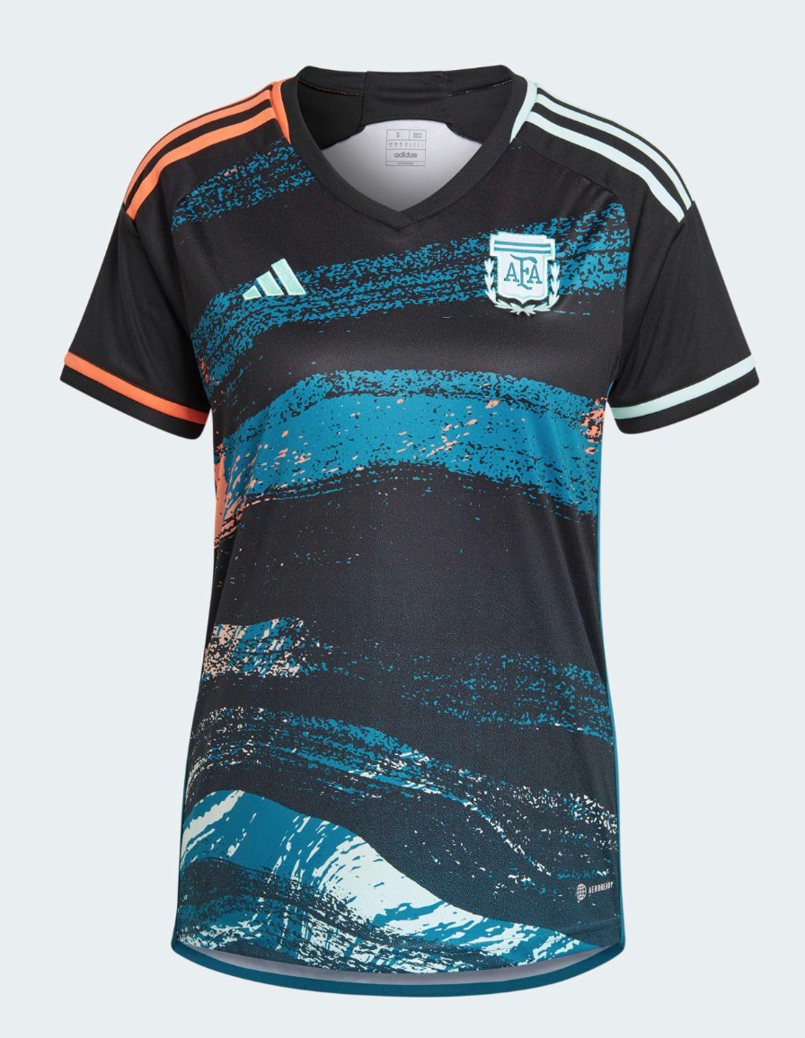
2. Argentina Away
I suspect this will upset some people, because mainstream shirts that are edgily overwrought like this (remember this abomination?) tend to be well-received by the hypebeasts. But let’s be honest – they were trying way too hard with this one, and it just didn’t pan out.
1. Zambia Home
It feels harsh to criticize the lowest-ranked team for their homemade kits, but it looks like a referee Halloween costume.

THE BEST
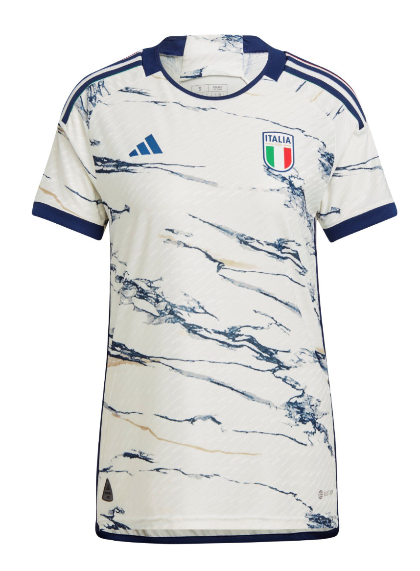
20. Italy Away
Harkening back to the legendary art and architecture forged from Italian stone, the marble swirl is both creative and culturally relevant, even if the execution doesn’t quite meet the lofty heights of the concept. The three stripes still feel wrong on an Azzurri/e kit, but at least they gave us more than a boring plain white.
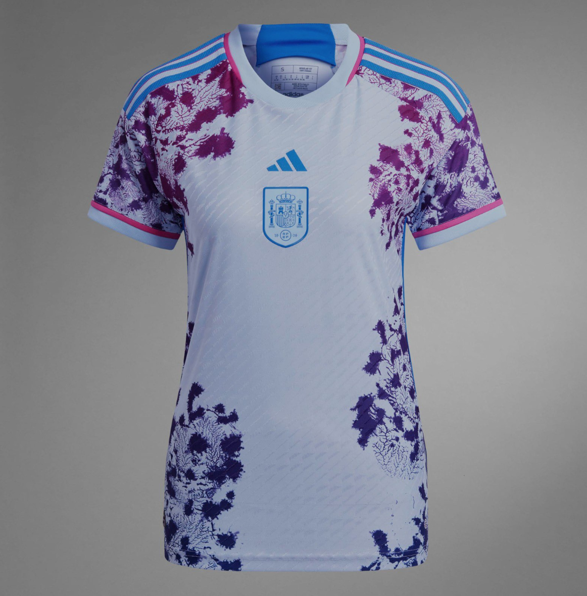
19. Spain Away
It’s so extra it had to make the list, even if I’m still not quite sure what to make of the coral ornamentation beyond “it looks pretty.”
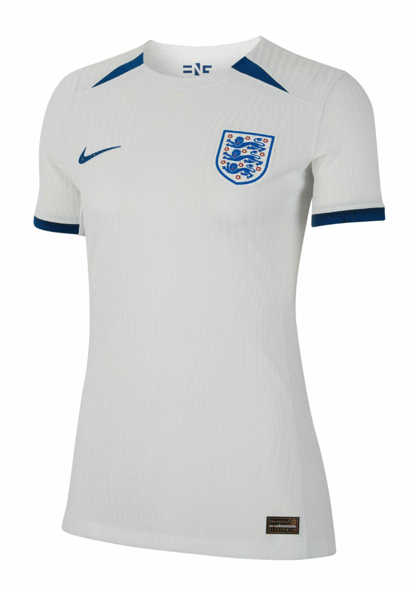
18. England Home
Simple, clean, effective. A humble opening act to the second strip (more on that later).
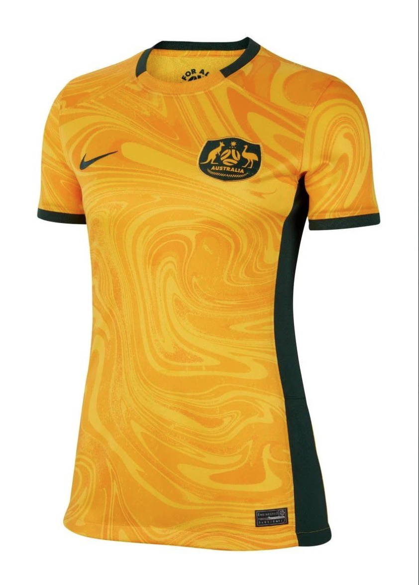
17. Australia Home
Yellow can be a difficult color to mold into a wearable jersey, so credit to Nike for brewing this rich golden oil slick contained by smart green accents for the co-hosts.
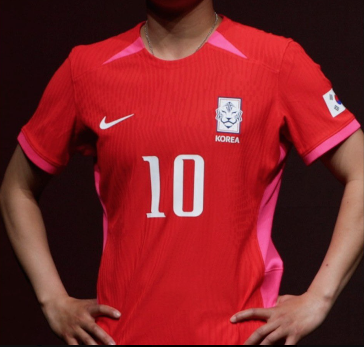
16. South Korea Home
It’s cookie-cutter structurally, but there’s a certain charm to the lesser-used subdued combination of analogous colors, as opposed to the contrast of complementary ones. The collar flares also bring a dash of nostalgia for what the men wore when hosting in 2002.
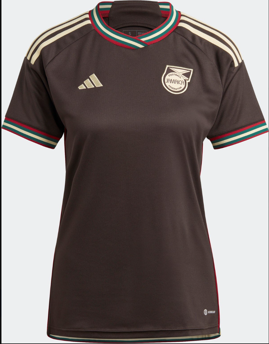
15. Jamaica Away
Jamaica themselves did most of the work by having such unique national colors, and Adidas lets them quietly shine through in this understated gem.
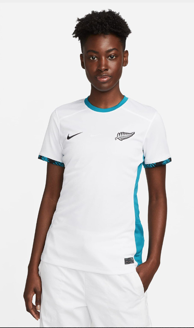
14. New Zealand Away
It’s not often that a football kit uses a particular shade or tone that makes you stop and think – have I ever seen this exact color before? I’m not sure I have, when it comes to the sky blue (?) trim used in place of the usual black accents here, but I do know I won’t mind seeing it again.
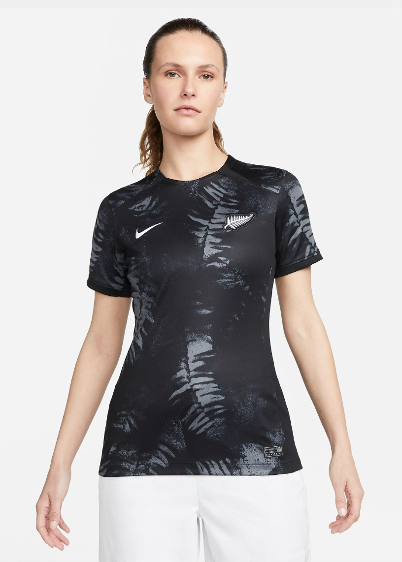
13. New Zealand Home
Their home effort isn’t bad either, with the smaller co-hosts dropping a bold black fern design that’s hopefully paired with black shorts for a compelling uniform on the whole.
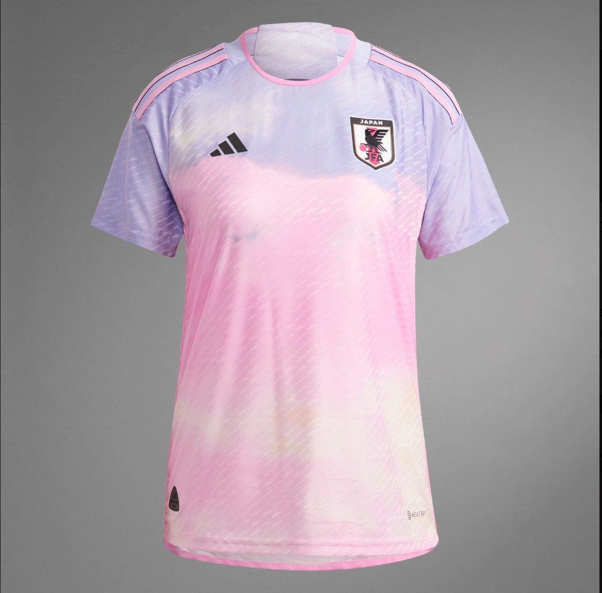
12. Japan Away
Finally, the perfect jersey to wear while listening to vaporwave.
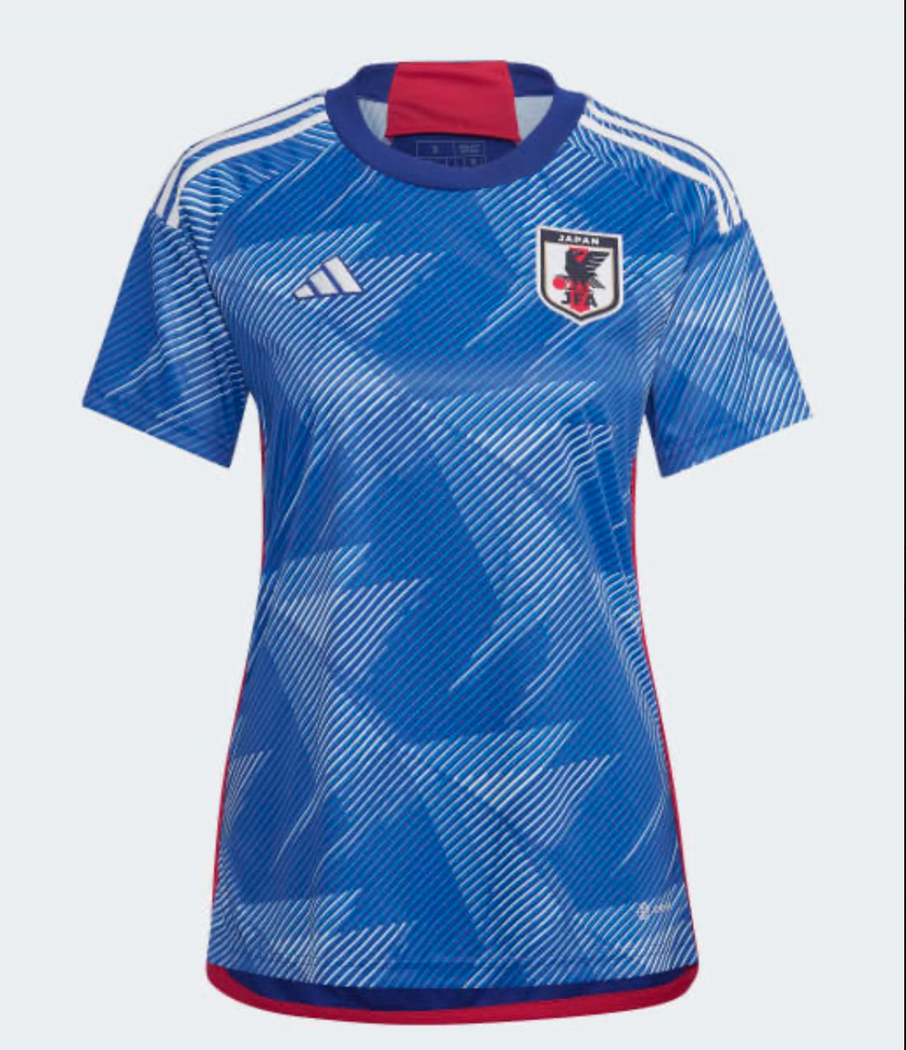
11. Japan Home
From the front, this is one of my favorites, as the synthetic angularity seems to invoke a sort of modernized Japanese wave. But from the back… it’s just a blank blue shirt, which breaks up the design, knocking this one out of the top 10. Adidas has struggled with this for some years now – stop making half a kit, the imagery should wrap all the way around like your competitors!
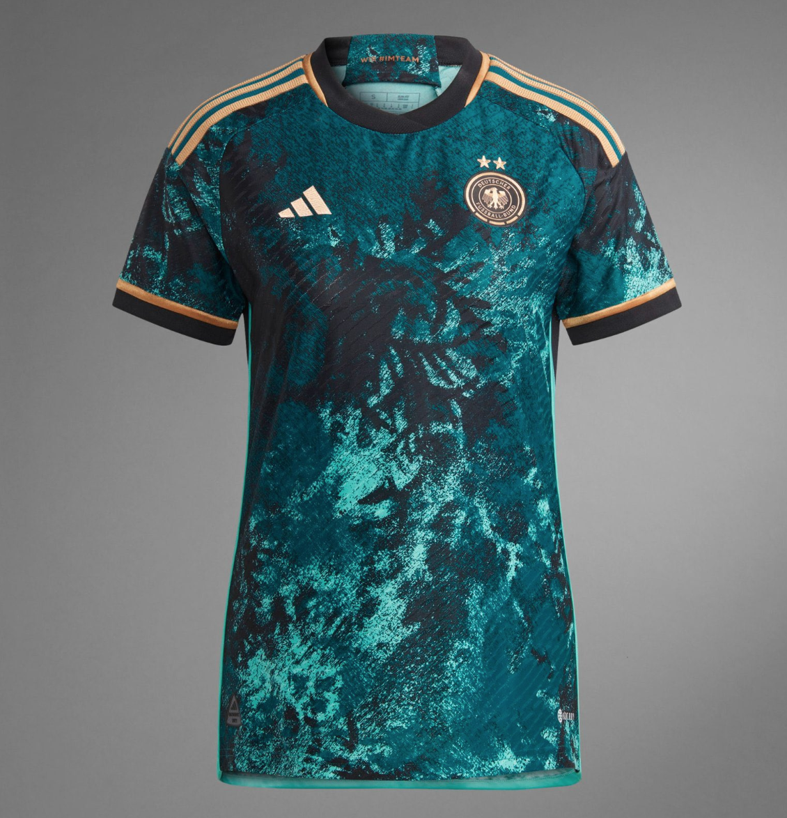
10. Germany Away
A captivating twist on the sometimes-tradition of a green away, this shirt is meant to represent the woodlands that cover a third of the country. But there’s a reason why the black forests of Germany are the setting of many a harrowing tale – facing this team of heavyweights will be similarly intimidating. (And the fact that the design continues fully around the entire shirt puts it solidly ahead of Japan.)
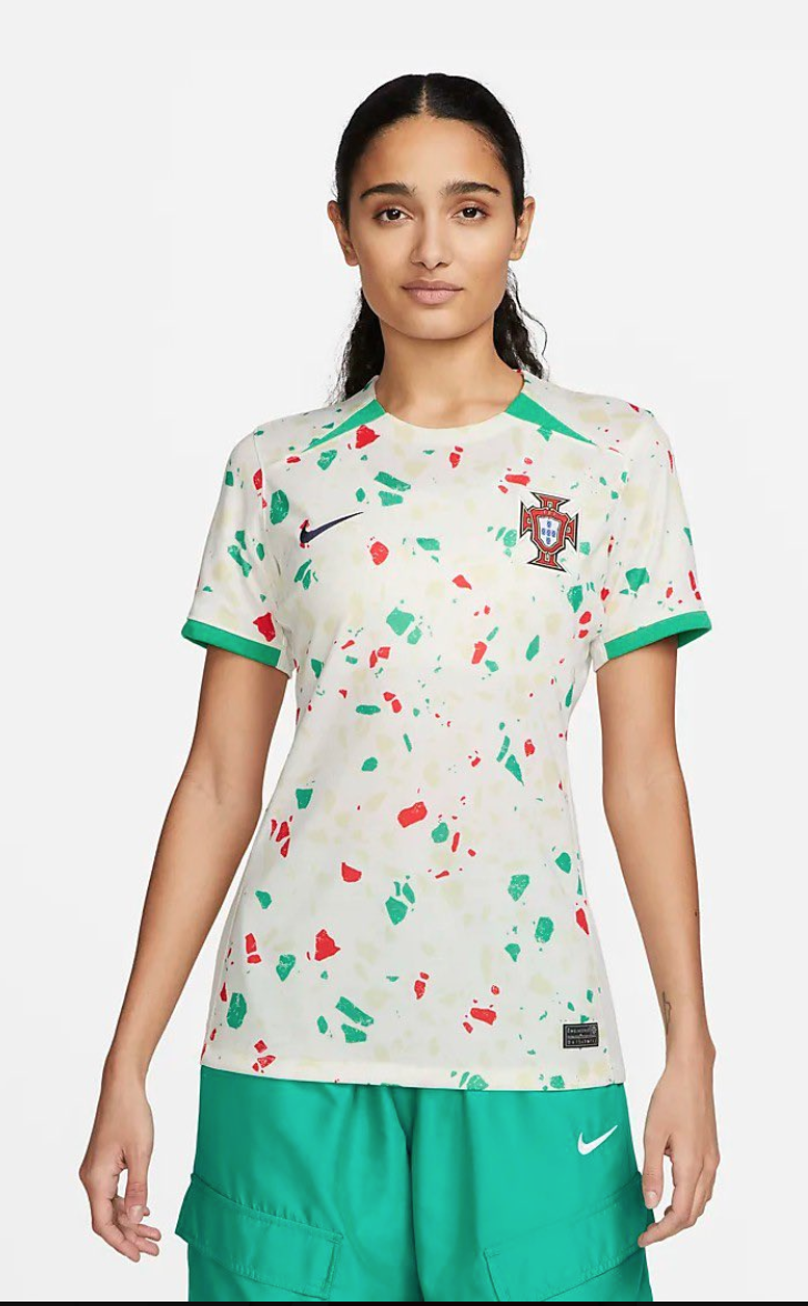
9. Portugal Away
Hell yeah, why not.
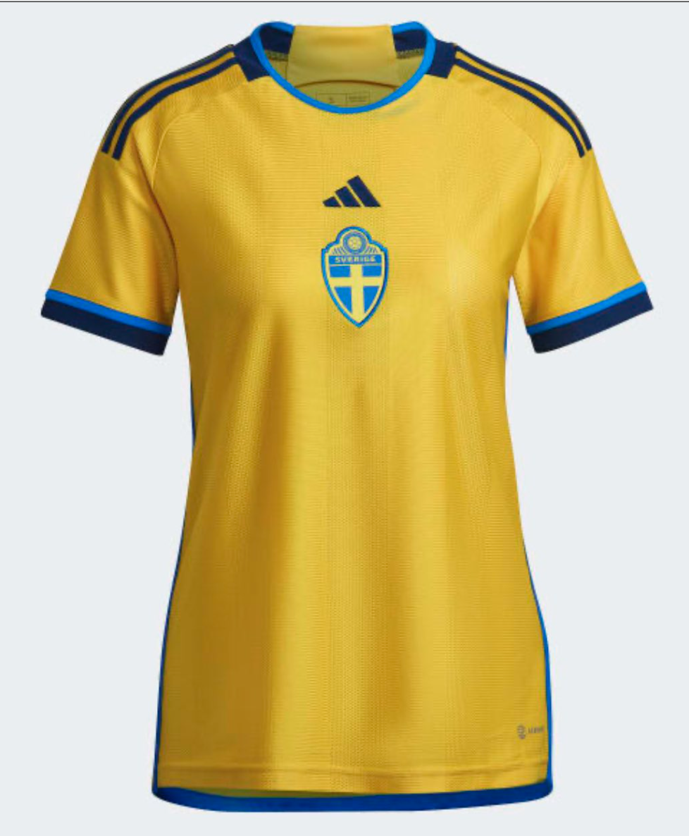
8. Sweden Home
From its centrally-placed badge and standout collar, the Swedes bring a pleasantly bold feel to the Cup.
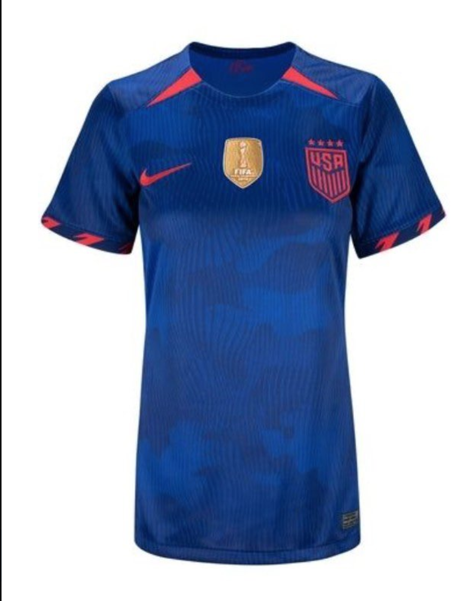
7. United States Away
This looks more like a superhero suit (or supervillain suit, depending on your point of view) than football kit, but then that’s fitting, as the two-time champions often appear to have superpowers when it comes to the world stage. The intensity of the red and blue clash drives home this point with aplomb.
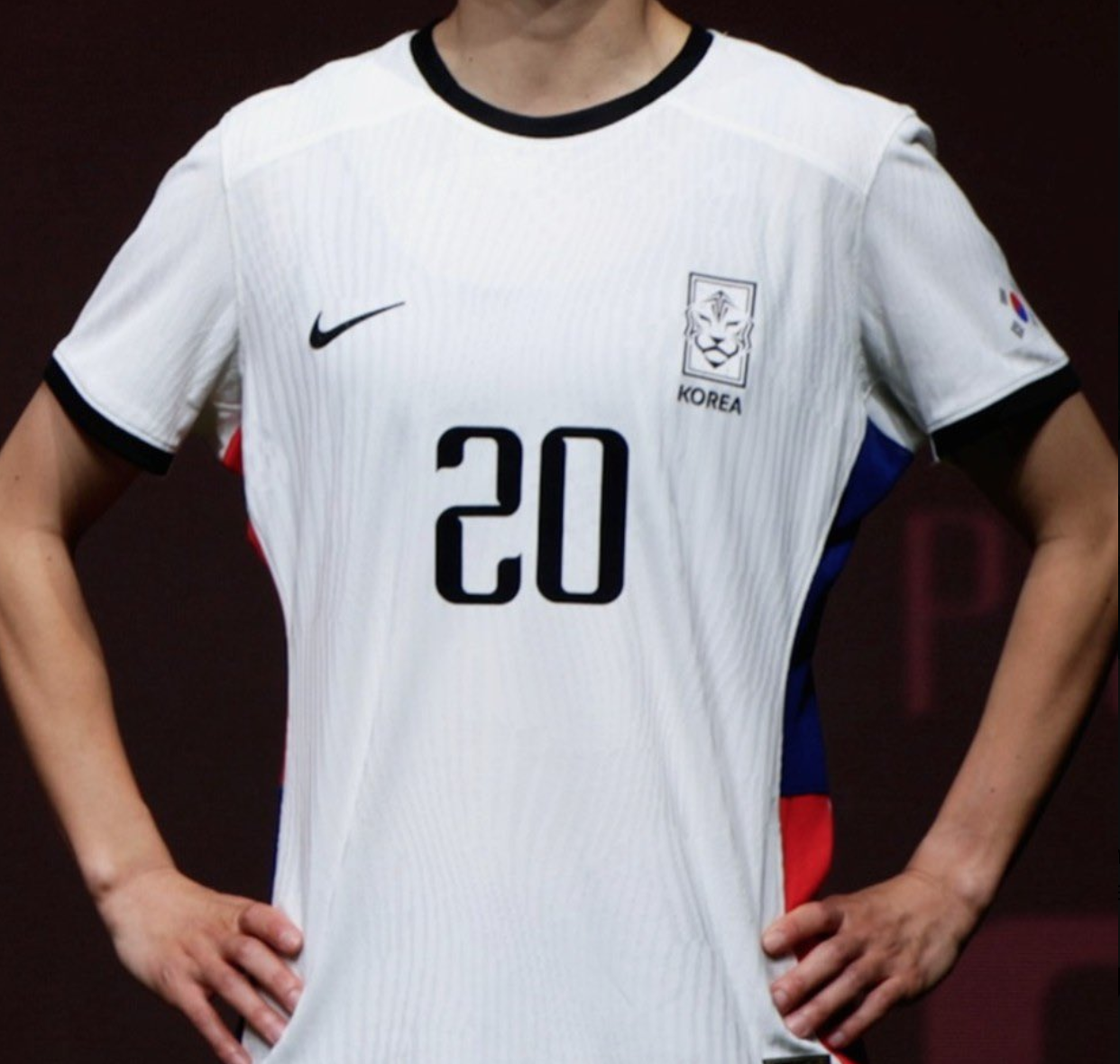
6. South Korea Away
Stunning. The sharp simplicity of the white and black from the front paired with the hidden two-tone flash of brilliance down the side is simply a work of art.
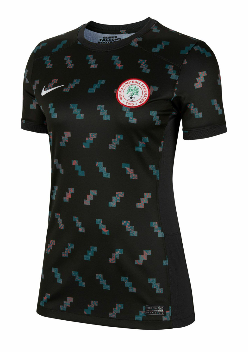
5. Nigeria Away
Now this is more like it from Nigeria – the forest green, so dark it appears black at first glance, pierced by a contemporary twist on traditional prints, is the perfect marriage of streetwear and sportswear we’ve come to expect.
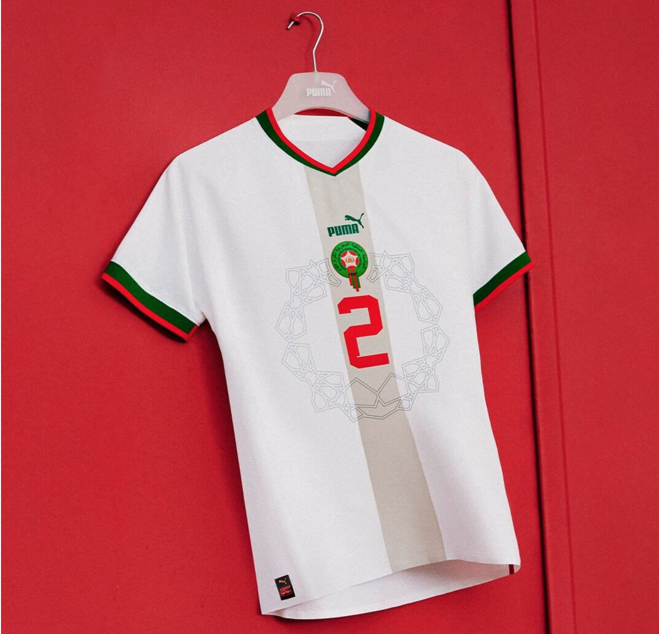
4. Morocco Away
It’s almost illusory how much Puma’s managed to cram into one shirt while keeping it still feeling fresh and light. It’s different, but still feels traditional, centered, and emanating.
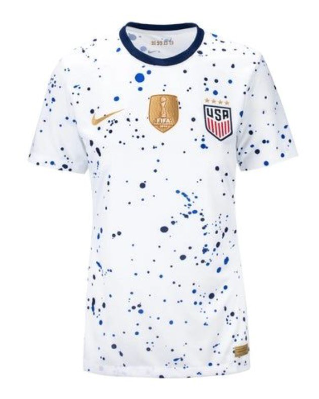
3. United States Home
If the away kit means business, the Americans are having fun with this one, and it shows. Most striped teams go through a brushstroke phase, to mixed results, but the paint splatters are new, and they’re not bad. The champion’s patch is also finally returned to the middle of the chest, flanked by smart golden flashes that hint at the threepeat that may be soon to come.
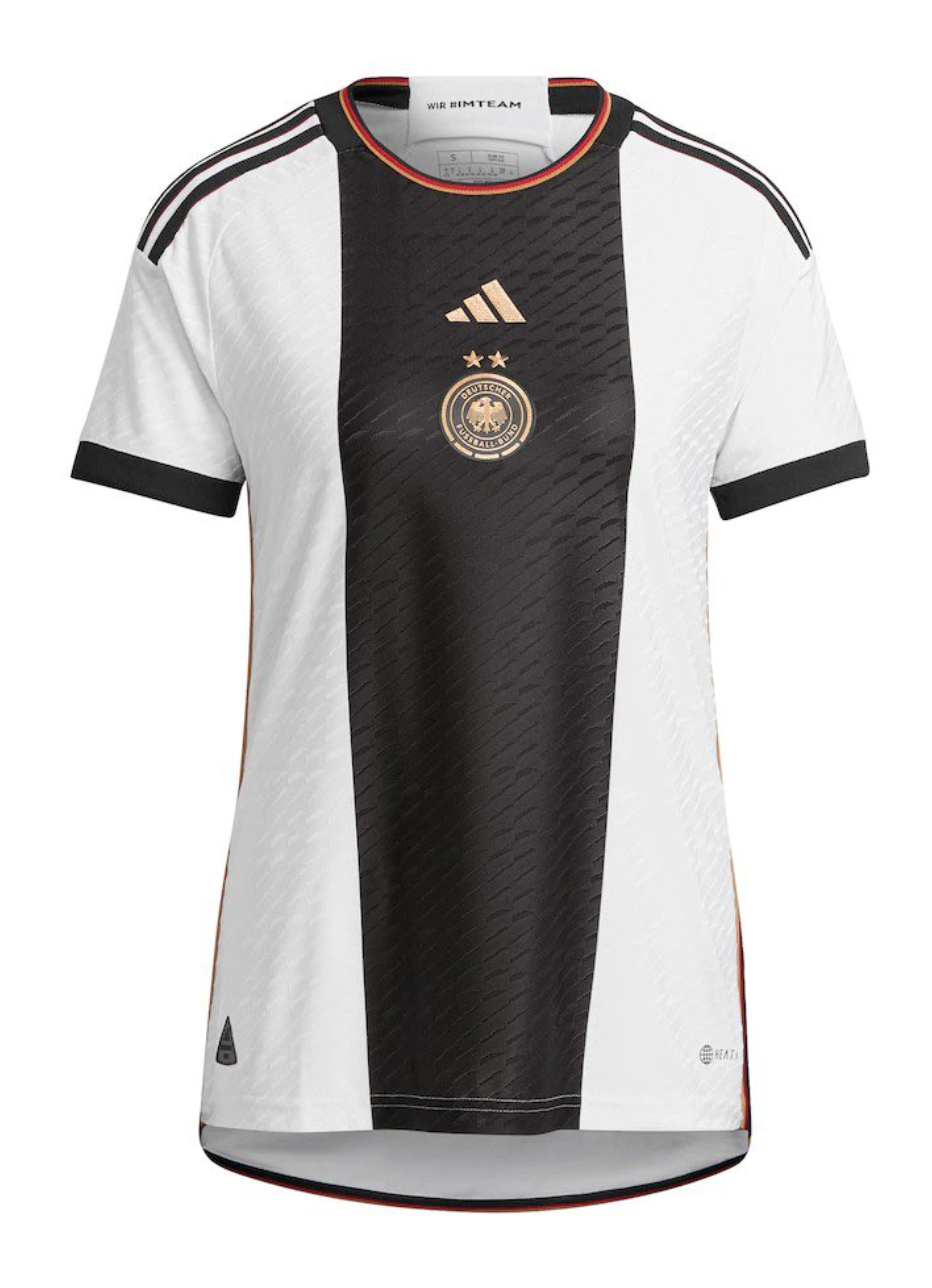
2. Germany Home
There’s a reason why Adidas didn’t bother making a different home shirt for the women’s team as they did an away – it’s simply too good to pass up using again. Commanding, striking, and perfectly accented by just a streak of color inside the collar, there’s a certain power in its symmetry.
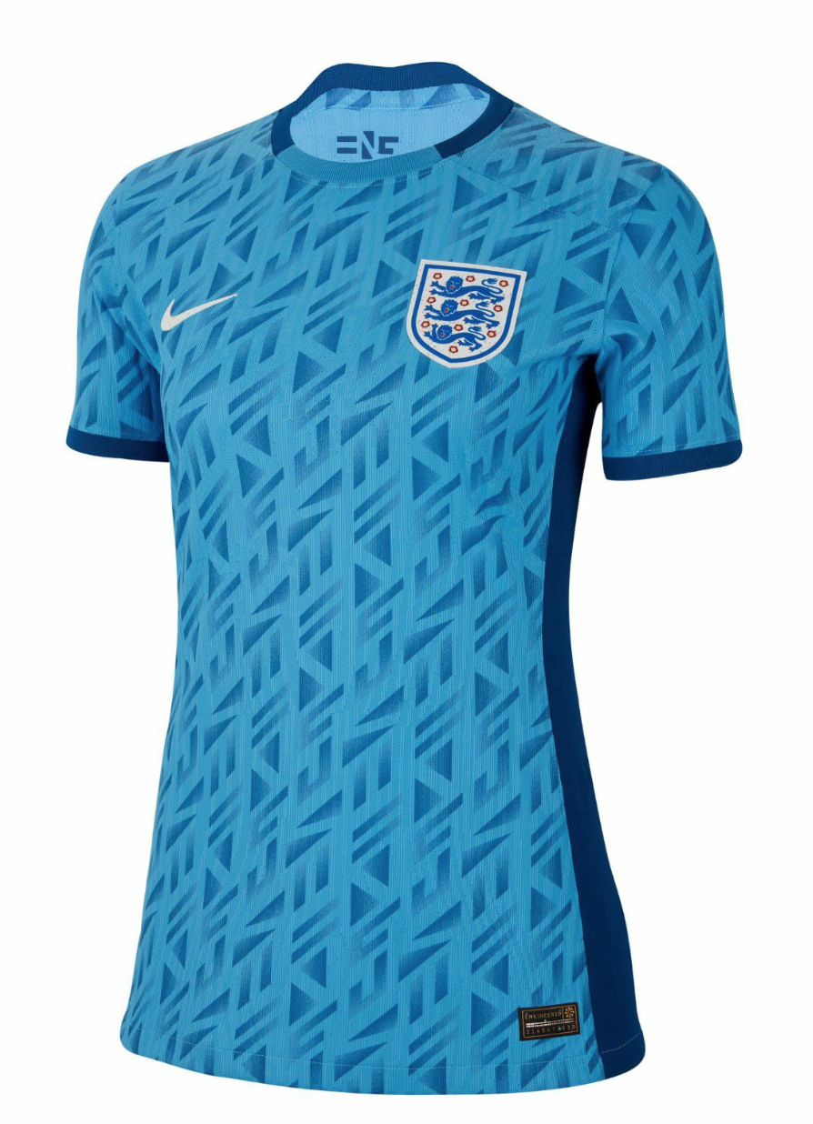
1. England Away
Now THIS is a football kit. Across most industries, marketing copy loves to wax poetic about honoring the past while looking forward to the future – but when the cliche is truly manifested, when the blend is genuinely perfect, it really is something to behold. With a healthy dose of retro pastiche firmly formed in a contemporary package, The Lionesses will be playing in style. Beautiful.
By: Weston Pagano / @westonpagano
Featured Image @GabFoligno / Naomi Baker / Getty Images
