The Worst Rebrands in Recent Football History
In recent years, in an attempt to pander to casual fans, many clubs are redesigning their logos, looking to appear more friendly, thus scrapping years of history, in favor of soulless and corporate-looking new logos. Today, we’re going to be taking a look at ten of the worst rebrands in football in recent years.
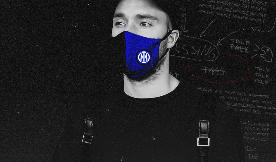
1. Inter Milan Trying to Look Sharper and Failing
In 2018, Inter have decided to remove the FC from its logo for a cleaner sleeker look. The colors have also been changed, with the gold being removed and the blue shade being altered. In my opinion, the old logo looked much more aesthetically pleasing and the new color makes it look like a crypto app.
2. Juventus Going Full NFL
Juve’s iconic badge was removed in 2017, with the current logo displaying just a stylized letter J. The classic shape of Italian football badges was scrapped, losing the club’s colours and the bull. To me, this is starting to look like an NFL badge.
3. Fiorentina Branching out into Health Insurance
The most recent redesign on the list, Fiorentina always had a very iconic badge, differing in terms of shape from the style of the rest of the Serie A teams. The elongated shape was scrapped in favor of a stocky rhombus with a less stylized symbol of Florence. Now it just looks like one of those banks where your grandparents take you to open your first account.
4. Girondins de Bordeaux Moving to Texas
This redesign received so much backlash from fans, that the club reverted to the old design. The proposed new logo featured the name Bordeaux Girondins, which makes no sense and makes it sound like a team from Bordeaux Texas.
From Trend Buckers to Quick Buckers: The Decline of Bordeaux
5. Hellas Verona’s Dodgy Crop
Hellas decided to replace their old logo with an element from the old one, namely the 2 mastiffs representing the Della Scala princes, that ruled the city in the 13th and 14th centuries. Again the old identity given by the classic shape of Italian logos is now scrapped in favour of a nonsensical logo, where it’s kind of hard to tell what it represents.
6. Everton FC’s Unsuccessful Rebrand of 2013
Everton decided to spruce up and modernize their crest with disastrous results. Everything was moved inside the shield, the motto was lost, and Prince Rupert’s tower gained a few pounds. Immediately a petition was created to get rid of the new emblem which went on to garner over 23,000 signatures. The next year Everton came out with the current version, which is an example of a rebrand done right. You can simplify stuff, whilst paying respects to the history and heritage of the badge.
Olympique Lyonnais: Failure, Success, and Everything in Between
7. Leeds United Transforming into an American Hardware Store
This hot mess was mocked by fans and rival teams as soon as it was announced. Worse still, it was supposed to celebrate the club’s centenary in 2019. Needless to say that Leeds reversed course immediately.
Racing Club de Strasbourg: The History Behind Les Bleu et Blanc
8. Bradford City Deciding to Branch out into the Fast Food Industry
This is actually supposed to go live this year and the club are currently in discussions with the fans over the logo. As you can tell, this will not do, unless the club wants to rebrand itself to Bradford Fried City.
9. Vincent Tan Proving You Don’t Need to Be Colourblind to Confuse Blue and Red
Cardiff City’s rebrand featured a change of colour as well as badge. The classic blue was replaced by red and the bluebird turned into a dragon. Thus the Bluebirds effectively lost their identity. The fans were obviously up in arms about this and the badge was reversed. Maybe their owner will realize that investing in facilities, scouting and youth development can be even more effective than changing the colours of the team.
10. Newcastle United’s New Kit and Colour Combo for Next Season
The Saudi national team or Newcastle United as they are known in England) will embrace their roots with a reported green third kit for next year. No definite designs are available at the moment, it remains to be seen how this will turn out.
By: Eduard Holdis / @He_Ftbl
Featured Image: @GabFoligno / Emilio Andreoli – Inter
