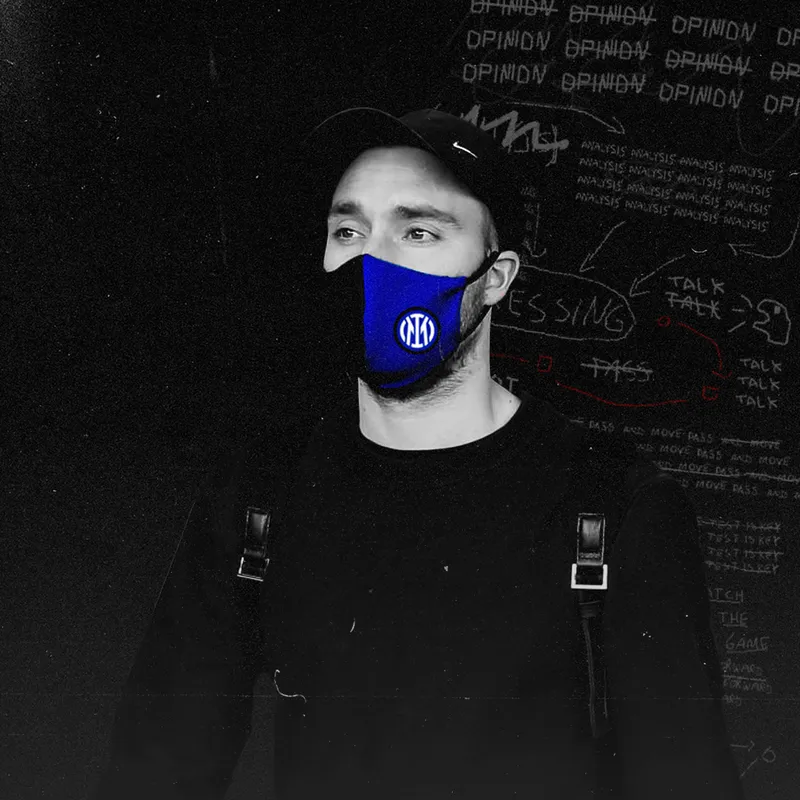
Illustrator Gabriel Foligno Photographer Emilio Andreoli – Inter
The Worst Rebrands in Recent Football History
In recent years, in an attempt to pander to casual fans, many clubs are redesigning their logos, looking to appear more friendly, thus scrapping years of history, in favor of soulless and corporate-looking new logos. Today, we're going to…
In recent years, in an attempt to pander to casual fans, many clubs are redesigning their logos, looking to appear more friendly, thus scrapping years of history, in favor of soulless and corporate-looking new logos. Today, we're going to be taking a look at ten of the worst rebrands in football in recent years.
1. Inter Milan Trying to Look Sharper and Failing
In 2018, Inter have decided to remove the FC from its logo for a cleaner sleeker look. The colors have also been changed, with the gold being removed and the blue shade being altered. In my opinion, the old logo looked much more aesthetically pleasing and the new color makes it look like a crypto app.
Credits
Words
Eduard Holdis