The Good, the Bad, and the Ugly - Ranking the 2026 World Cup Kits
The 2026 FIFA World Cup finally kicks off tomorrow, and you need to be prepared for what you’re going to see. No, I’m not talking tactical analysis or bracket predictions - it’s time for the all-important jersey rankings. Despite this…
Illustrator Gabriel Foligno Publication Europa Press Sports
The 2026 FIFA World Cup finally kicks off tomorrow, and you need to be prepared for what you’re going to see. No, I’m not talking tactical analysis or bracket predictions - it’s time for the all-important jersey rankings.
Despite this being the second most monochromatic World Cup of all time, there’s still plenty of diversity and even some kit controversy. (If your first thought upon seeing Nike's awkward, peaky shoulder seams was, “this looks like it was made by someone that’s never worn a shirt before,” you’d be right - it was designed by AI.)
With this edition’s expanded format and several nations even packing third kits, there are a staggering 106 different jerseys across 13 different suppliers that can be worn this summer. We’ve selected the 10 worst and 25 best, ranked below for your viewing pleasure. Let’s dive right in.
The 10 Worst
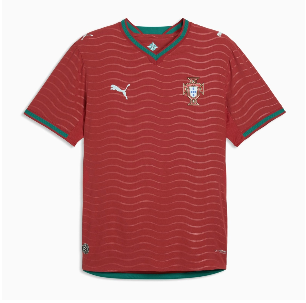
#10 Portugal Home
Whether you see a drab, off-color salmon fillet, or wavy grill lines on a slab of red meat, this lazy effort will have Cristiano Ronaldo looking cooked. And if the aging striker’s ego sandbags this talented Portugal side, that may turn out to be more than apt.
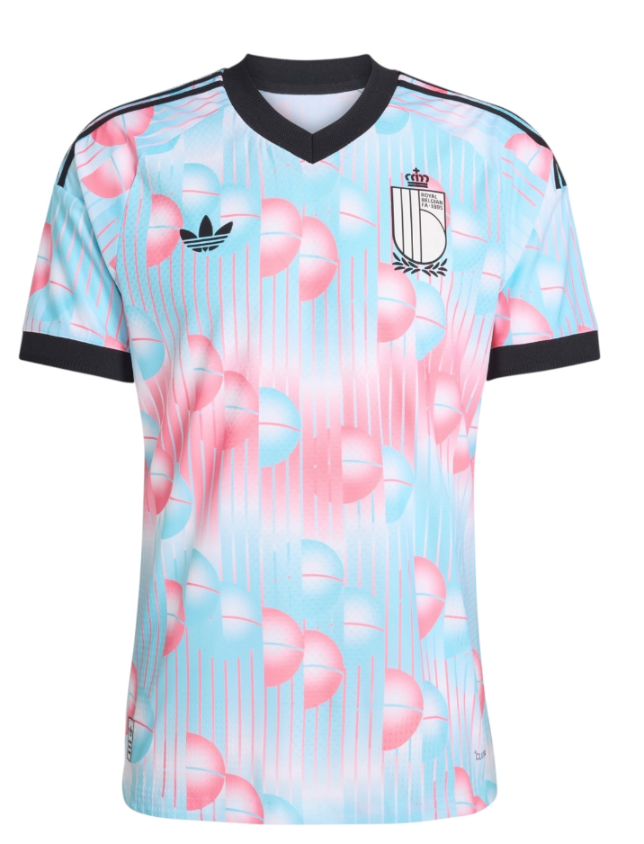
#9 Belgium Away
Don’t get me wrong, Belgian surrealist René Magritte is a legend, and it’s genuinely cool that they’re honoring him in this way. But his famous piece that says “Ceci n'est pas une pipe” (“This is not a pipe”) under a picture of a pipe was making a wry statement on how it was really just a representation of a pipe and not the actual thing. So to put “Ceci n'est pas un maillot” (“This is not a jersey”) on the back of this shirt fundamentally misunderstands the work - it defeats the entire purpose because this literally is a jersey, not a painting of one! (And its debut was one of the worst kit clashes I’ve ever seen.)
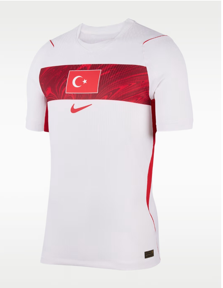
#8 Türkiye Away
They can’t keep getting away with it! Slapping the entire, rectangular flag on the front makes it look unlicensed.
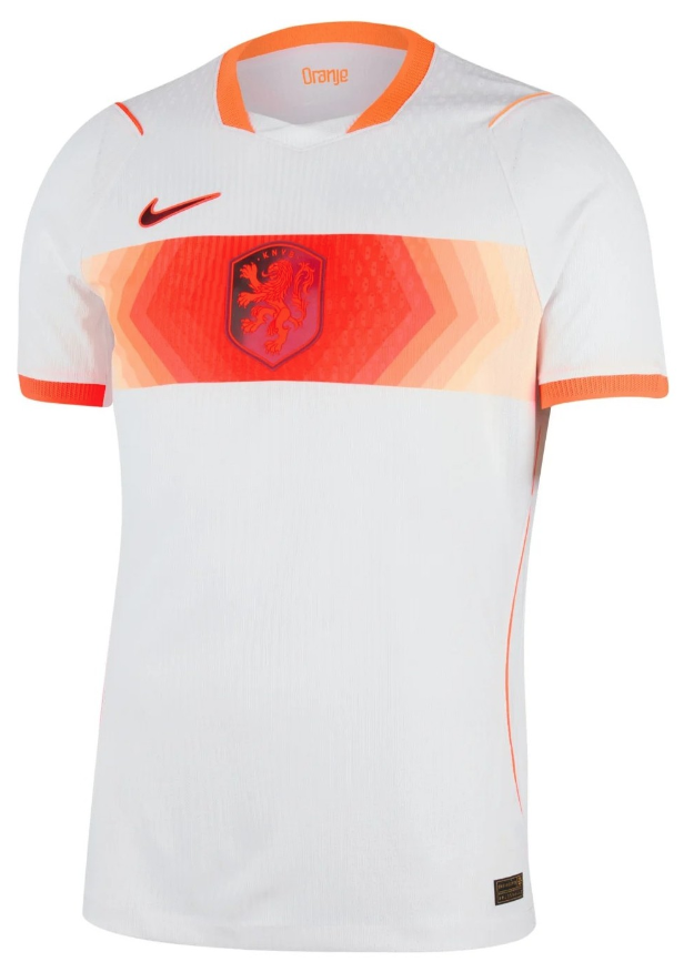
#7 Netherlands Away
This looks like the printer ran out of ink in the middle of making a Türkiye away. Why is it that atrocious color? Why is the Nike swoosh over there? Just awful.
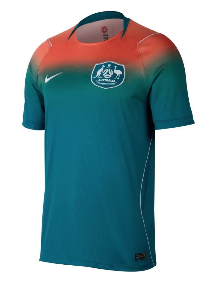
#6 Australia Away
I think it’s supposed to represent a sunset over the ocean, but it really just looks like Gumby got a bad sunburn.
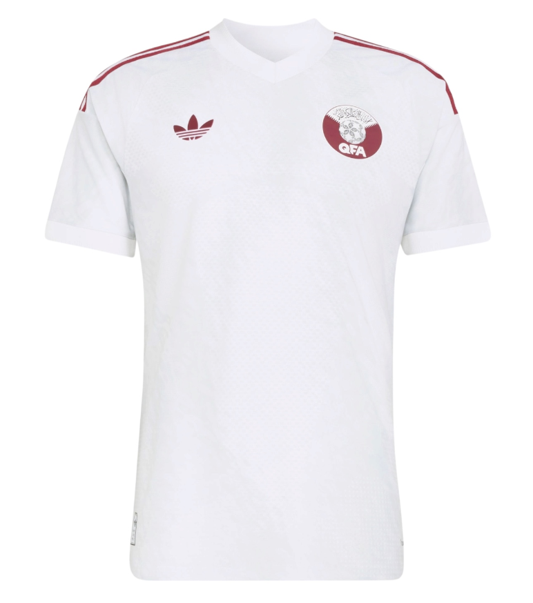
#5 Qatar Away
They forgot to design this one.
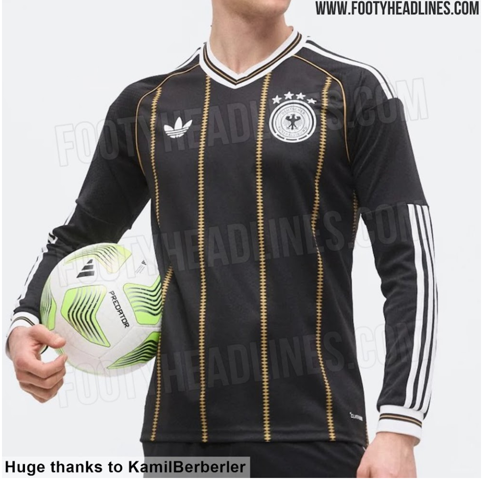
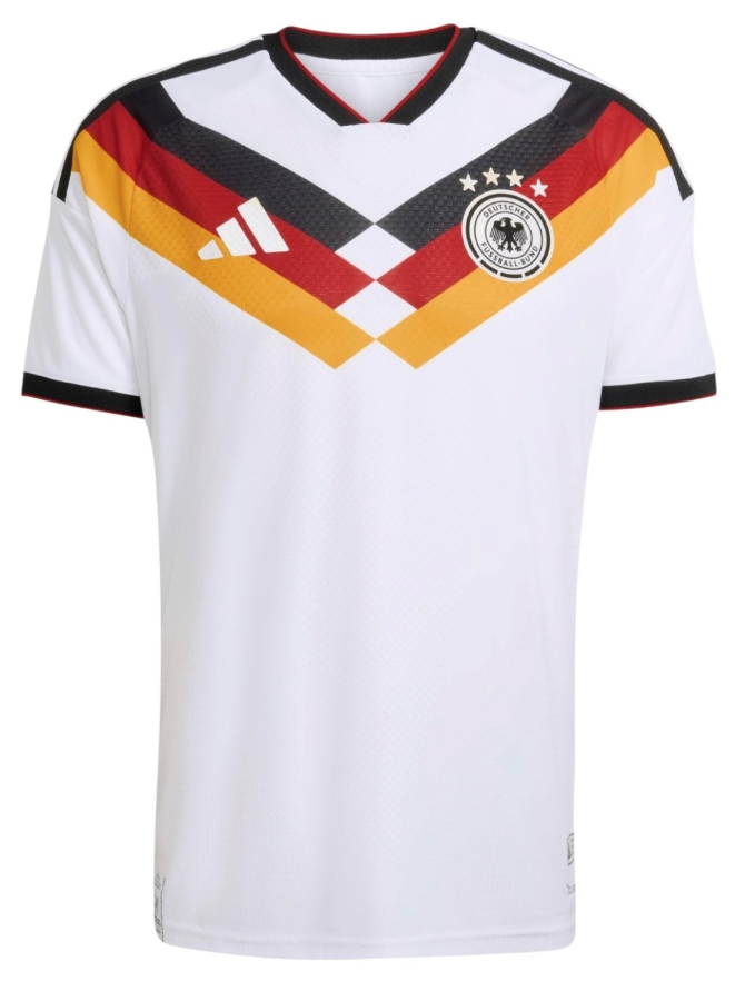
#4 Germany Third
This feels like Adidas was so bitter about losing Germany to Nike that they decided to make them a very ugly shirt as a parting gift. It hasn’t been released yet, and may actually not come until after the tournament is over if rumors are to be believed, but just the risk that we could have to see it as part of a surprise drop mid-cup is bad enough.
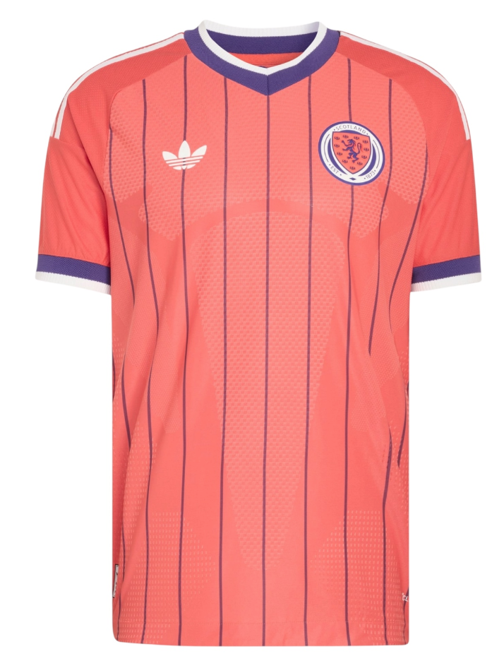
#3 Scotland Away
I get that there is some history in this decision, but that doesn’t make it the right one. Hideous.
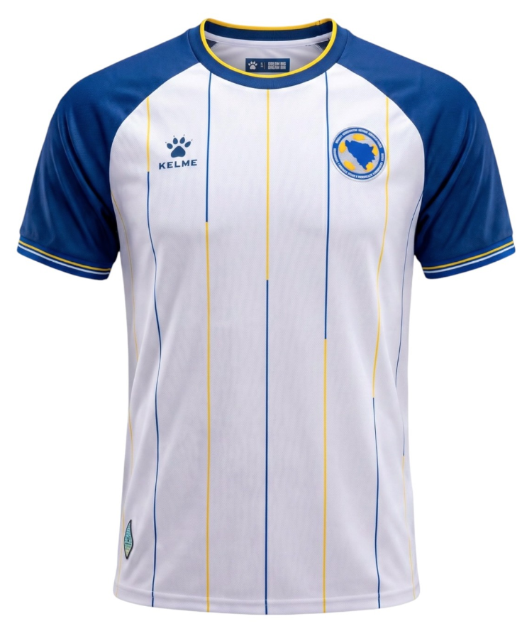
#2 Bosnia and Herzegovina Away
This is so awkward and uninspired I don’t even know where to begin. Simultaneously childish yet outdated, it looks like the least-picked template on one of those cheap sites for adult rec league gear.
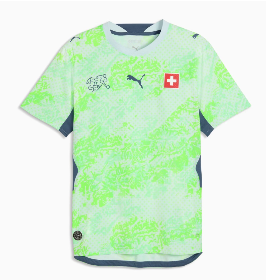
#1 Switzerland Away
This is physically painful to look at. It feels like a highlighter pen stabbing is stabbing me in the corneas. There should be a class action lawsuit for anyone who has to see this on TV.
The 25 Best
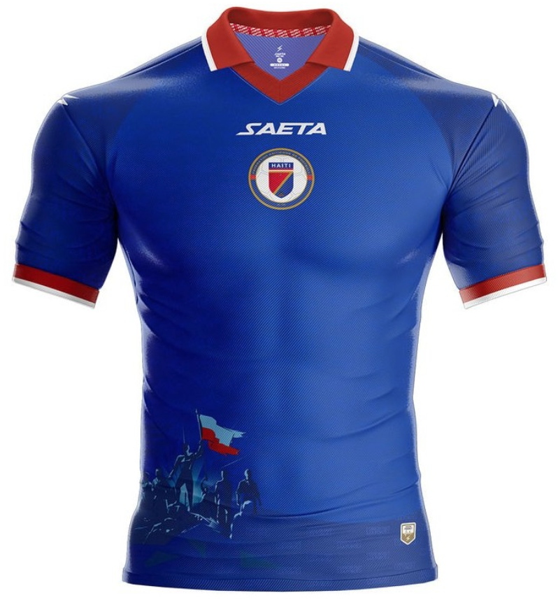
#25 Haiti Home
Aesthetically, it may not be that incredibly special. But it gets bonus points for putting revolutionary freedom fighters on the front (just don’t tuck it in), and the most intensely-muscled invisible mannequin you can imagine.
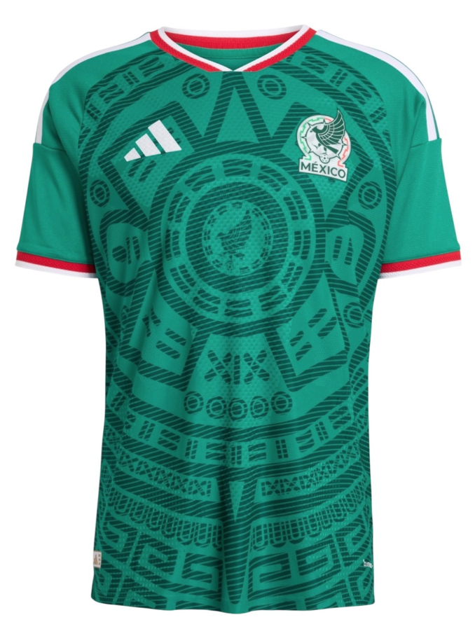
#24 Mexico Home
I have to be honest - I want to like this El Tri effort more than I actually do. The Aztec motif never gets old, but this particular shade of green feels plasticy and fake. Why did they copy their (controversial new) crest in the center when it’s already on the badge? It’s such a missed opportunity when the concept is this strong but the execution leaves a lot to be desired.
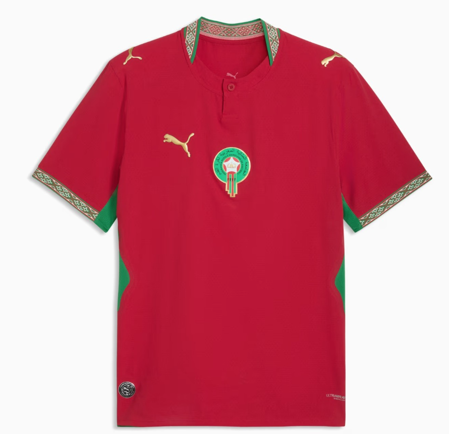
#23 Morocco Home
Another one that came so close to greatness but frustratingly falls short. The collar and cuffs are divine, the shades of red and green are elegant, and the gold accents are a nice touch for the (technically speaking) African champions. But why oh why is the Puma logo on the side if the Moroccan crest and number are in the center? Either put them both on the sides, or both in the center, but this lopsided inconsistency derails the entire piece.
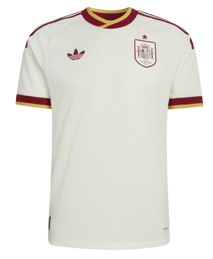
#22 Spain Away
The hues here are wonderful - what satisfying shades of red and white, like a classy canvas for the European champions to make their own art with out on the pitch.
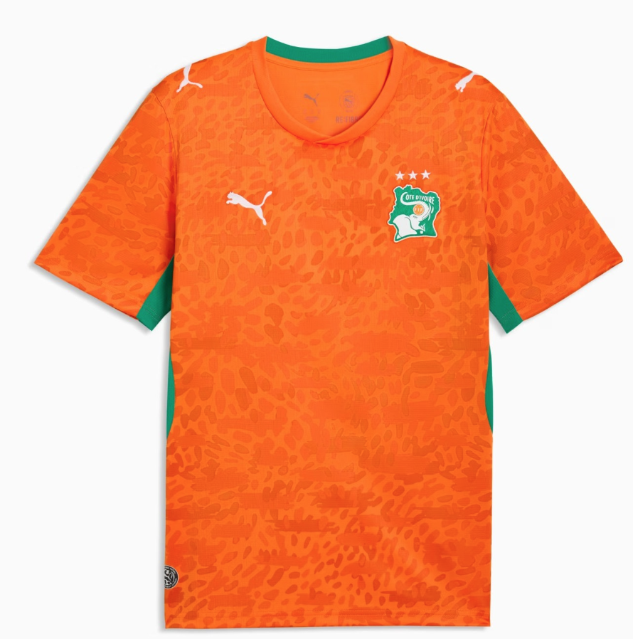
#21 Côte d’Ivoire Home
Orange jerseys are difficult to pull off, and cheetah print is even bolder. Somehow, Côte d'Ivoire combines the two in striking fashion.
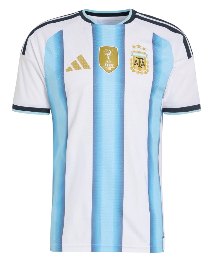
#20 Argentina Home
At first glance, this may look like an ordinary Argentina kit with some gold details rightly pressed on top to celebrate their 2022 victory. But the reason this one makes the list is a clever detail many may miss - within the celeste stripes is each and every shade of sky blue La Selección have worn in their previous successes on the world’s stage combined in a spectrum from past to present. Now that’s history done right.
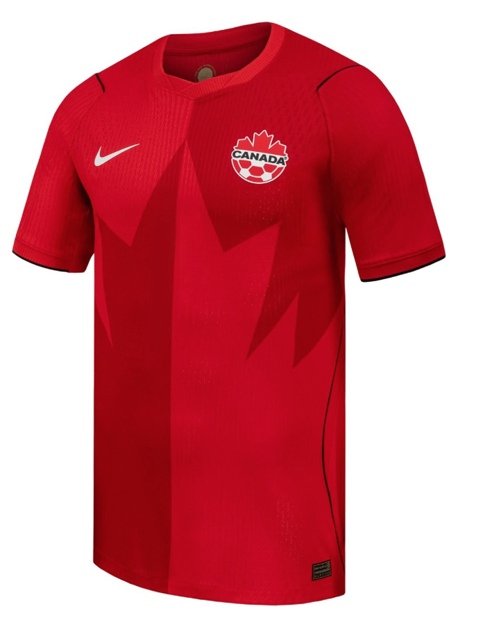
#19 Canada Home
Credit to co-hosts Canada for threading the needle between simplicity and statement, with an implied maple leaf adorning a brazen two-tone red. It’s loud but not crazy, clever but not overwrought.
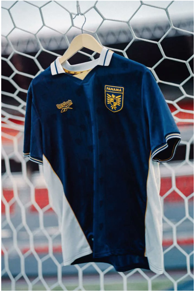
#18 Panama Third
I don’t think the rich blue cutting between white shores was meant to evoke Panama’s famous canal, but this savory colorway and clean accents combine beautifully regardless.
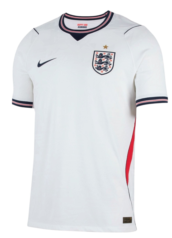
#17 England Home
It’s a sharp shirt, even if it looks like the wearer’s been stabbed in the side.
#16 Germany Home
There’s something poignant about Adidas’ final home shirt for Germany, on which they drape their three stripes heavily across the shoulders. It’s so on the nose, it almost feels like a fan concept instead of the real thing.
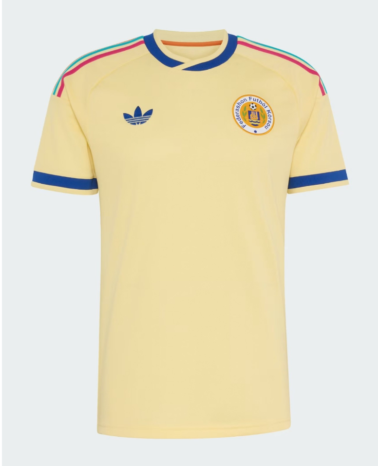
#15 Curaçao Away
The smallest nation to ever qualify for the World Cup, both in terms of landmass and population (just 156,000 - fewer than the amount of fans that attended the 1950 final), Curaçao arrives in style with this class cream kit. It’s a shame we won’t even see it worn unless The Blue Wave pull a miracle to get out of their group.
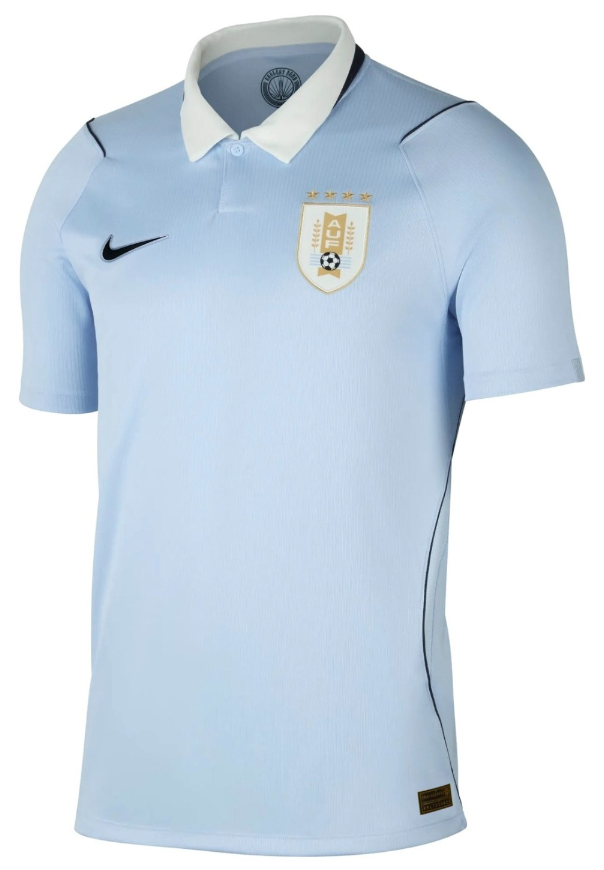
#14 Uruguay Home
A white collar over black accents instead of picking one color for both was a bold choice, but I think they’ve pulled it off. Uruguay get points here for a strong balance of shirts in totality - if the away looks ready for battle, the home is ready for business.
#13 Cape Verde Home
Cape Verde put themselves on the map, and then they put the map on themselves, celebrating their moment with an angular pattern that traces the positions of the islands that make up their humble archipelago.
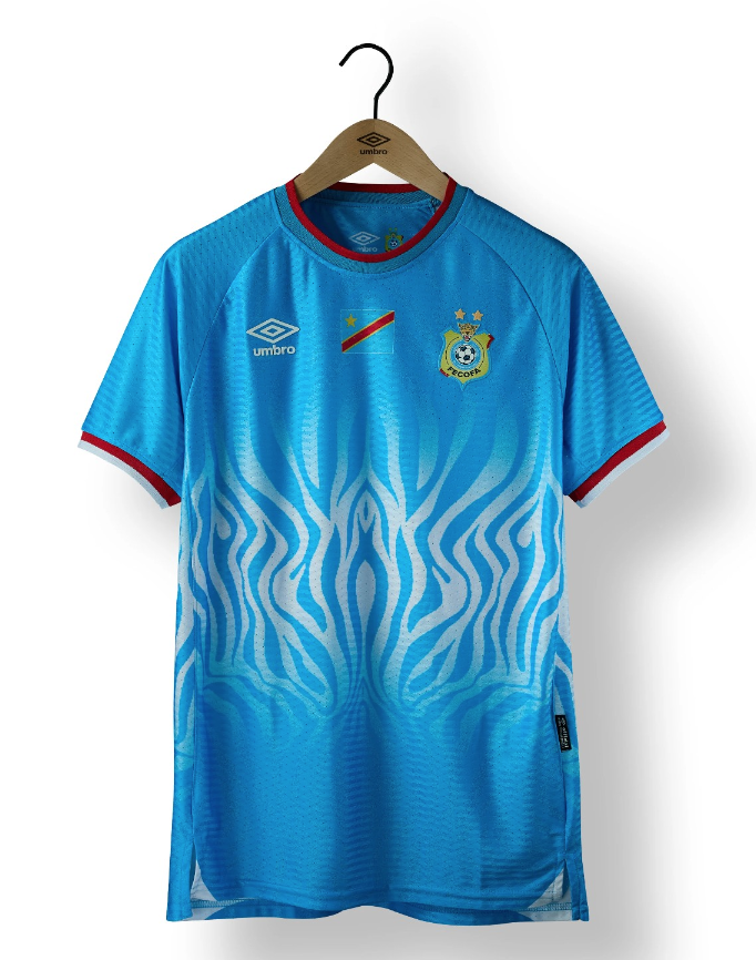
#12 DR Congo Home
I imagine this is the last thing you see when a zebra charges you out of the blue.
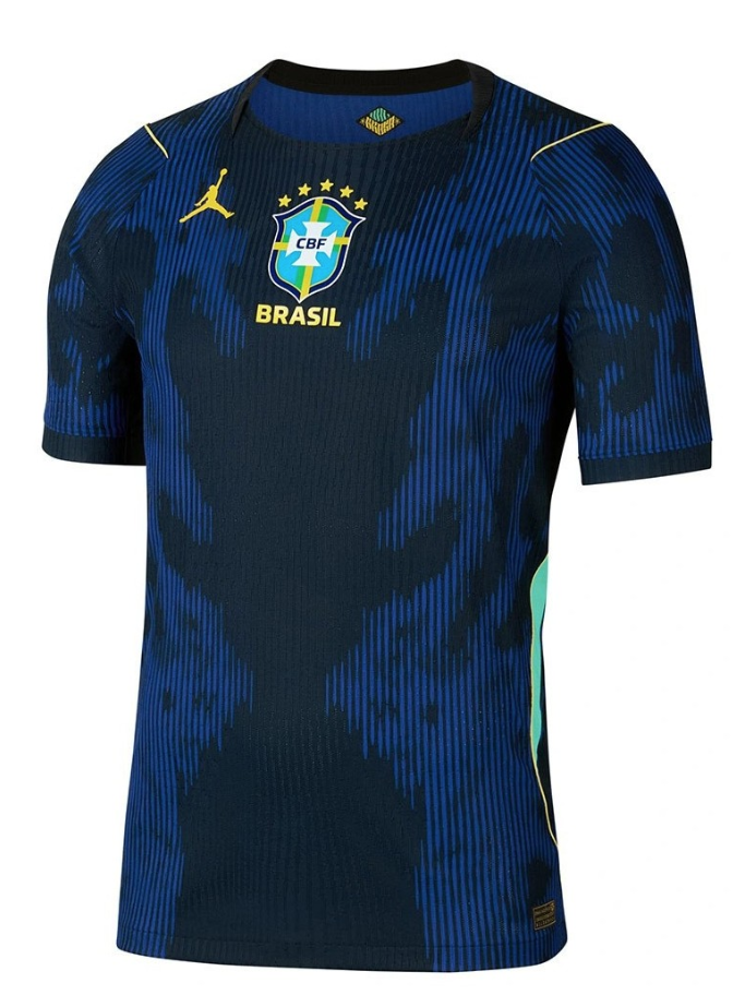
#11 Brazil Away
There’s a lot going on here. Meant to evoke a poison dart frog pattern, this deeply alien Rorschach test could show us either joy or despair, depending on the performances that come to be associated with it. From a marketing perspective, it’s bizarre to see a basketball player dunking on Brazil’s crest (can you imagine Pele bicycle kicking the Bulls logo on an NBA jersey?). I’m not quite sure what to make of it all, but I can’t deny it’s captivating, even if the shorts look like the wearer has had an unfortunate accident after one too many caipirinhas.
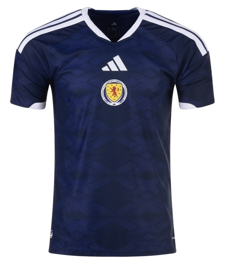
#10 Scotland Home
Now THAT’s how you do a centered shirt - the brand logo and crest BOTH go in the middle. The Adidas stripes are way too big this cycle, but even that can’t bring down the overall result, especially when the subtle iconography throughout is so lovely.
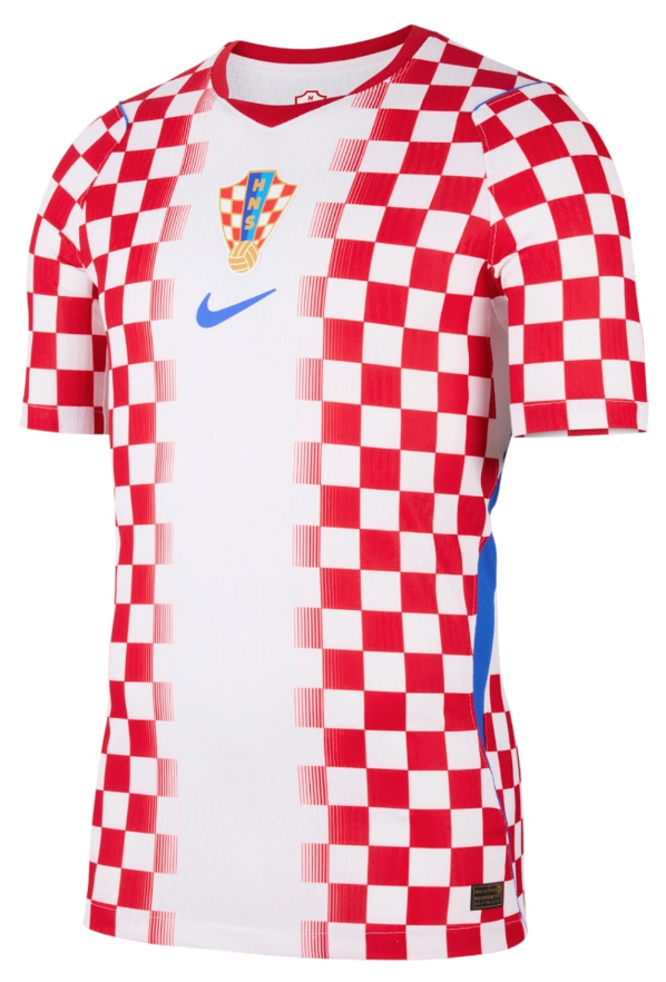
#9 Croatia Home
You know it, you love it - another checkered banger for Luka Modric’s farewell cup.
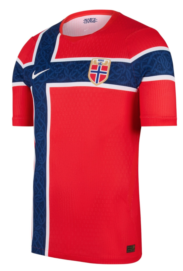
#8 Norway Home
You don’t see teams’ national flags just printed straight on their tops that often for a reason, but when it works it works. The Nordic knot pattern fortifying the cross is a classy touch on a shirt that would only ever work when done by a supplier that doesn’t add its own fingerprint too heavily - ie this would be far too cluttered with Adidas’ three stripes layered on top.
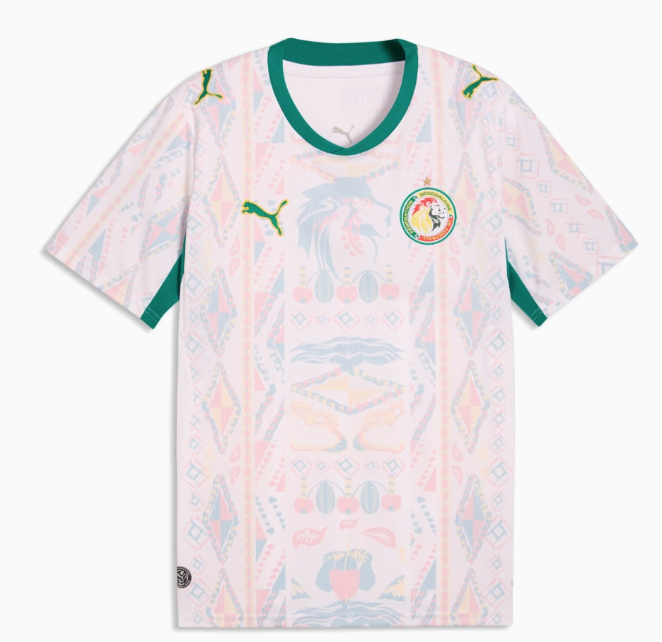
#7 Senegal Away
Credit to Puma for bringing so much of their countries’ cultures through in their kits. The Lions of Teranga are no exception here, with a textured motif of Senegalese symbols filling in between just enough green bordering to feel complete.
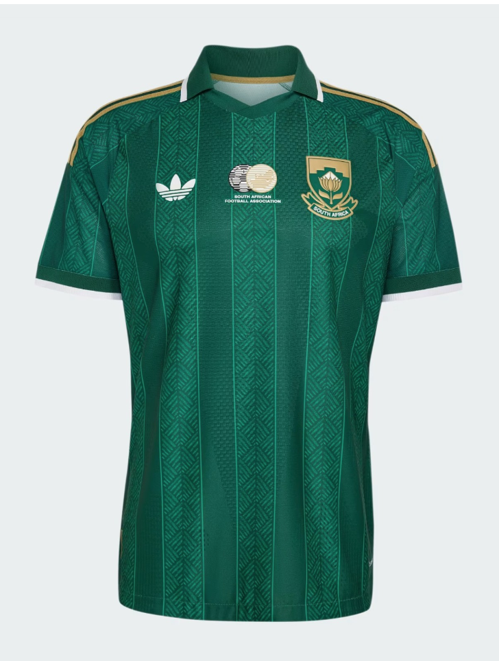
#6 South Africa Away
It is frankly a crime that this smart top will not be seen in any of South Africa’s three group stage games. I was already sympathetic toward Bafana Bafana, but I’ll especially be hoping they progress to the knockouts so we can see them bring this one out.
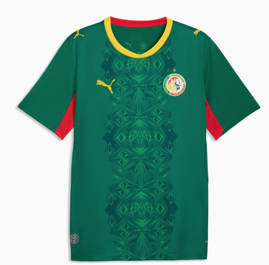
#5 Senegal Home
You don’t see a lot of green in football fashion, but when you do, it’s almost always impressive. Though their AFCON trophy may be (temporarily?) taken from them, the gold around the neck is fitting for a Senegalese side looking to dazzle on the pitch in style. They simply have to make it out of the group so that they can get a chance to wear this.
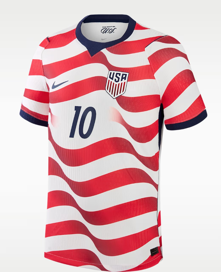
#4 USA Home
Combining the vertical stripes from the last time they hosted with the horizontal hoops from arguably their most beloved jersey, the American players themselves designed this waving flag for their home tournament, and the result is frankly iconic. Fans have long wanted this sort of look to become a consistent home motif instead of the completely unique (or incoherent?) switch-up they get every time - could this be the beginning of a real identity being forged? That might depend on how they play in it.
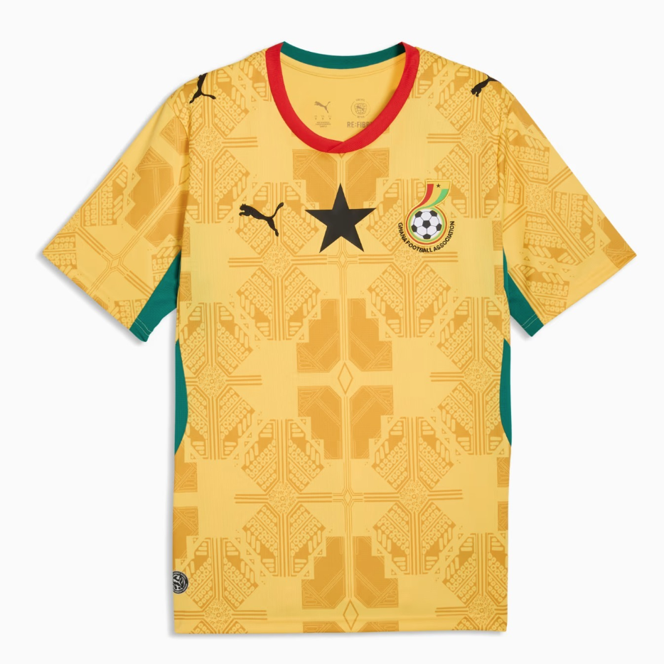
#3 Ghana Away
The Black Stars have struck gold with this Kente cloth-inspired stunner. Grounded yet radiant, it’s a great example of bright colors done right.
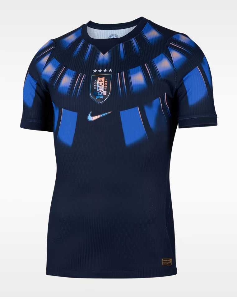
#2 Uruguay Away
You’d be forgiven for thinking that Uruguay is going for a superhero suit here, with many noting the similarities to Black Panther’s garb. But the reality is far more unique, with the inspiration actually coming from fabled World Cup ground Estadio Centenario’s curved stands, culminating in what’s both a touching concept and bold execution.
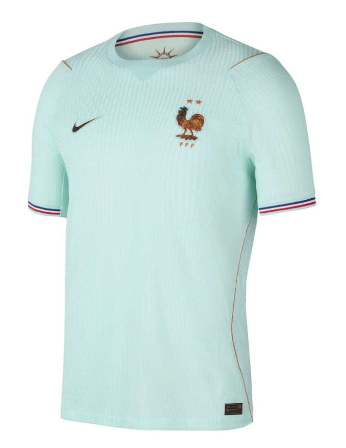
#1 France Away
Now this is what we come here for. This mint green beauty with copper accents and the tricolore cuffs is a stunning nod to historic gifts exchanged between France and their World Cup hosts - a burgeoning United States lent them their red, white, and blue, and Paris returned the favor by sending them the Statue of Liberty, in all its oxidized glory. Les Bleus will be hoping to come full circle, with the final venue just a few miles away from this national landmark.
Credits
Words
Weston Pagano
More from Breaking The Lines coming soon.
Visit the profile to follow and get notified when the next piece lands.